Navigate with Confidence
Turn-by-turn directions guide drivers directly to the most likely area tofind a space, rather than to the exact destination. This minimizes circling around.

Finding parking means weighing a dozen little variables at once. SlotSpot brings them together to help drivers find the right spot faster.
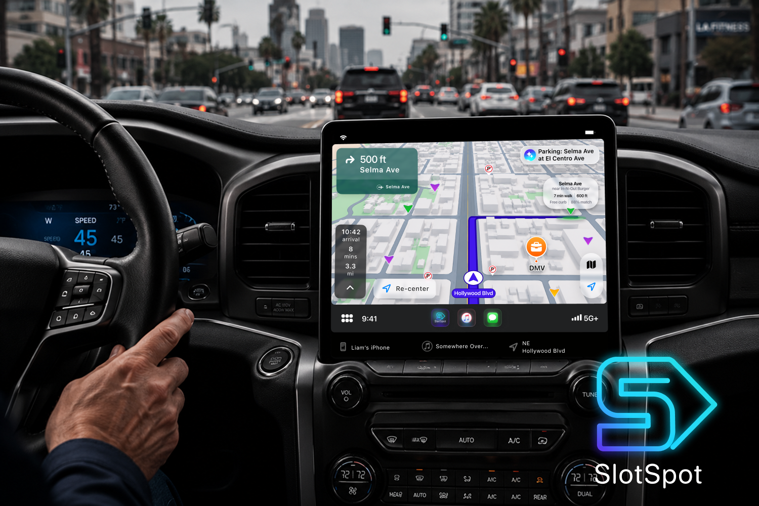
You can click through the final design by clicking the button, or continue through the story below.
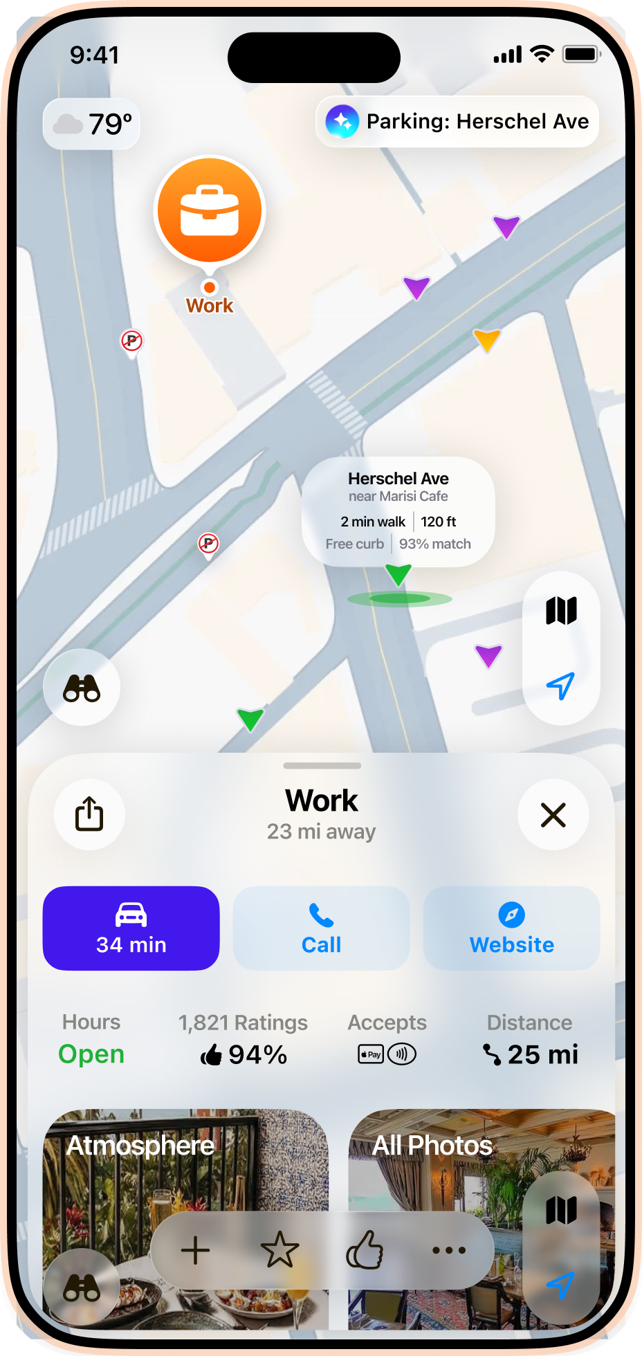
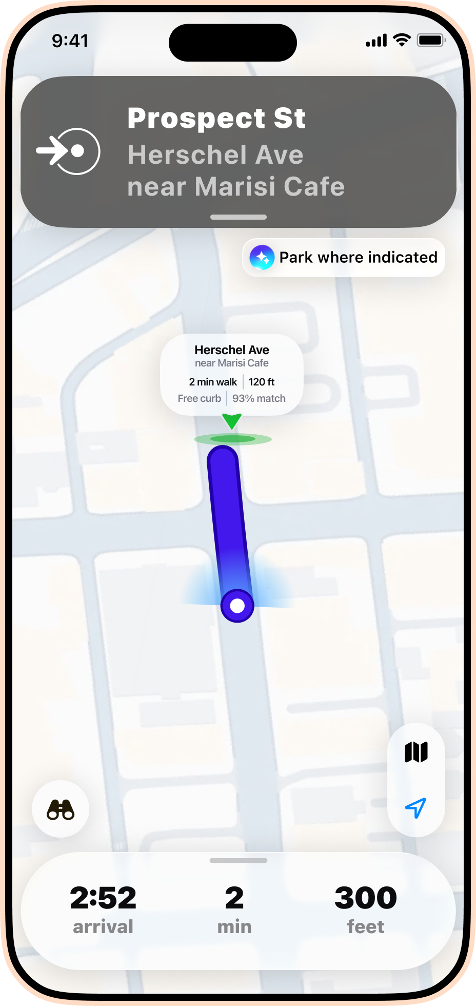
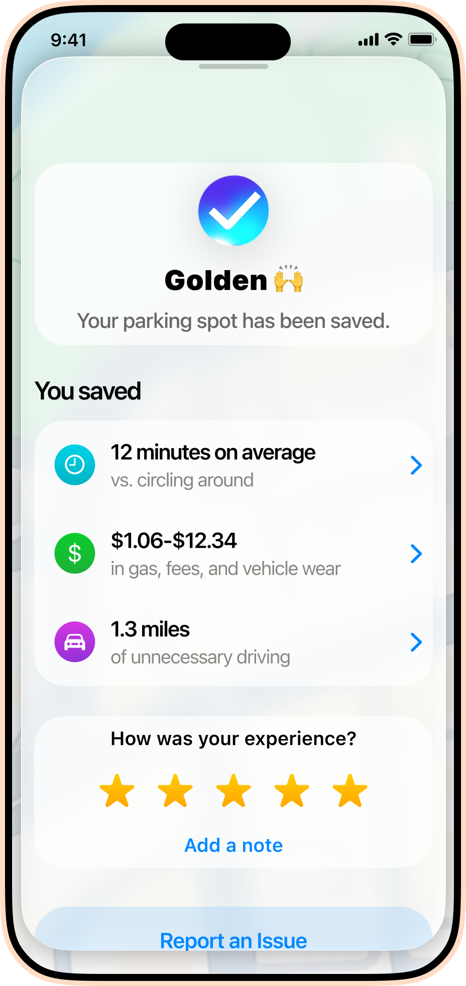
The experience centers on three moments: finding parking, getting there with confidence, and understanding savings.

Turn-by-turn directions guide drivers directly to the most likely area tofind a space, rather than to the exact destination. This minimizes circling around.
Compare time, price, and walking distance before deciding where to park.
SlotSpot users anonymously share real-time parking data intel to help SlotSpot narrow down likely available parking spots.
Parking isn't just finding a place to leave your car. It can be a stressful series of decisions about proximity, cost, safety, and convenience, all while navigating traffic and uncertainty.
How might we make finding parking feelfaster, clearer, and less stressful, even inhigh-demand areas?
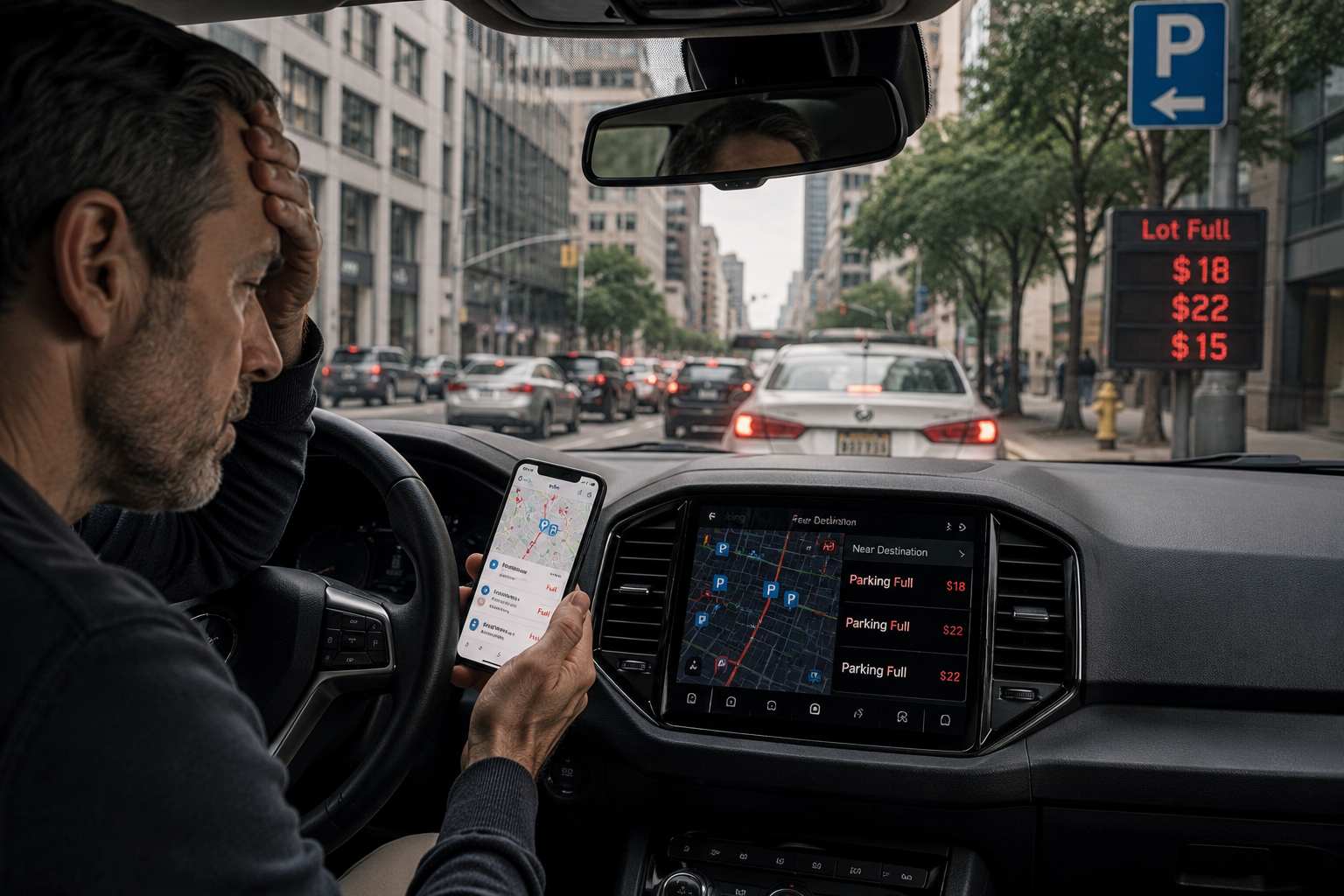
To better understand the problem, I spoke with commuters and audited current parking apps. Clear patterns emerged across nearly every conversation.
While each driver's experience was unique, the same concerns surfaced again and again: wasted time, unnecessary cost, and stress.
Lorem ipsum dolor sit amet, consectetur adipiscing elit, sed do eiusmod tempor incididunt ut labore et dolore magna aliqua. Ut enim ad minim veniam, quis nostrud exercitation ullamco laboris nisi ut aliquip ex ea commodo consequat. Duis aute irure dolor in reprehenderit in voluptate velit esse cillum dolore eu fugiat nulla pariatur.
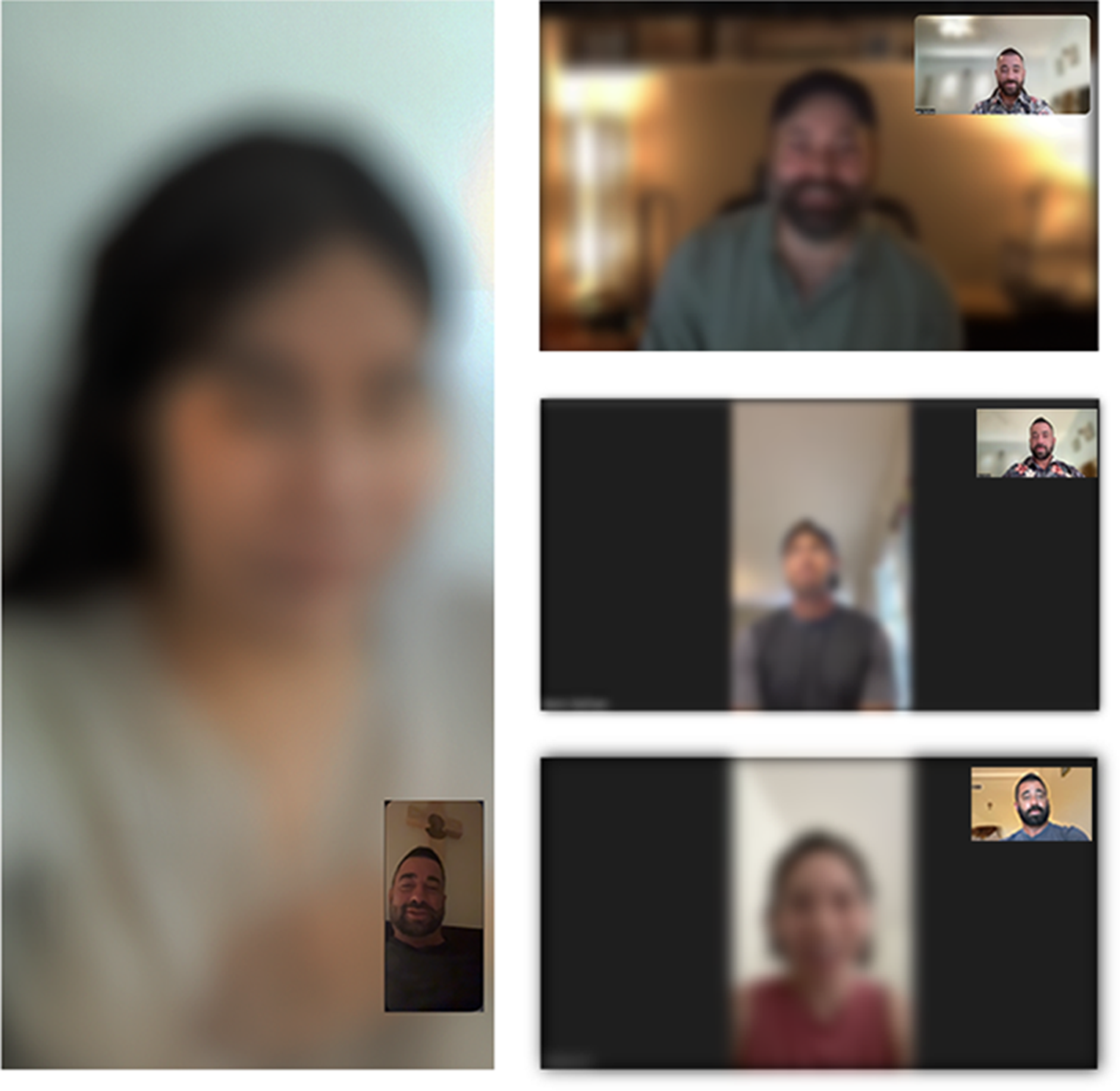

KATHLEEN
Busy mother of five
"I usually choose the area that feels the safest, even if it means walking farther."
KEY INSIGHT
Safety often outweighs convenience.
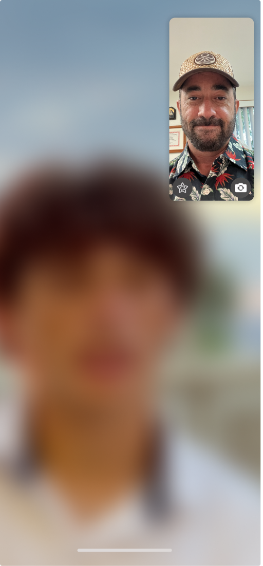
JAMES
Rideshare driver
"I often end up paying more than I want to for parking, because free spots are hard to find at peak hours."
KEY INSIGHT
Drivers constantly balancing cost against time.
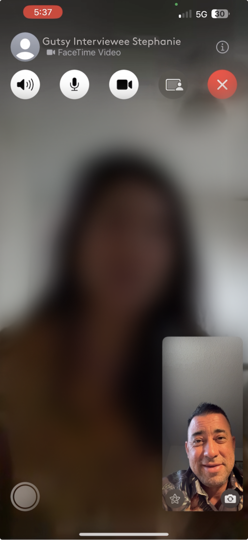
JACK
Bartender in busy town
"At work I always have to circle around for like 25 minutes or so before finding a free spot, and it's so stressful."
KEY INSIGHT
Uncertainty creates stress long before drivers arrive.
Stress, cost, and time consistently shaped parking decisions, regardless of where people were driving.
Lorem ipsum dolor sit amet, consectetur adipiscing elit, sed do eiusmod tempor incididunt ut labore et dolore magna aliqua. Ut enim ad minim veniam, quis nostrud exercitation ullamco laboris nisi ut aliquip ex ea commodo consequat. Duis aute irure dolor in reprehenderit in voluptate velit esse cillum dolore eu fugiat nulla pariatur.
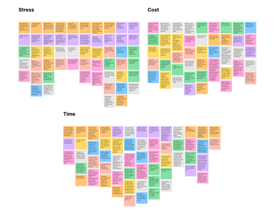
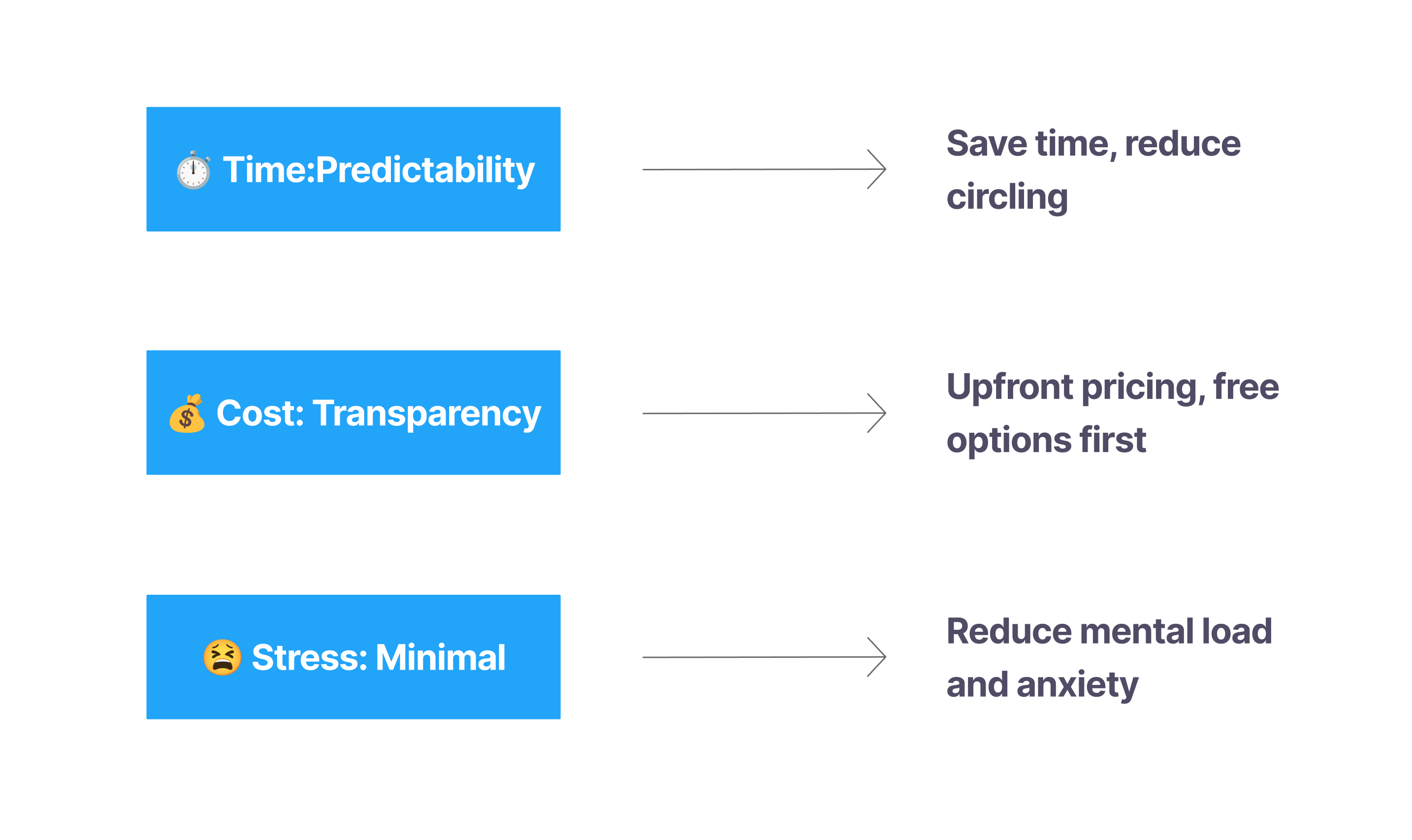
Research findings were synthesized into a focused set of design priorities to guide every feature decision, ensuring the experience consistently reduced time-consuming uncertainty, increased cost transparency, and helped drivers make confident parking decisions that reduced stress.
Lorem ipsum dolor sit amet, consectetur adipiscing elit, sed do eiusmod tempor incididunt ut labore et dolore magna aliqua. Ut enim ad minim veniam, quis nostrud exercitation ullamco laboris nisi ut aliquip ex ea commodo consequat. Duis aute irure dolor in reprehenderit in voluptate velit esse cillum dolore eu fugiat nulla pariatur.
TIME
Reduce time spent ssearching for parking.
KEY INSIGHT
Tracking has to feel easier than remembering.
COST
Prioritize free parking and make costs clear.
KEY INSIGHT
Health factors rarely exist in isolation.
STRESS
Reduce uncertainty and guesswork through predictability.
KEY INSIGHT
More data doesn't necessarily mean more clarity.
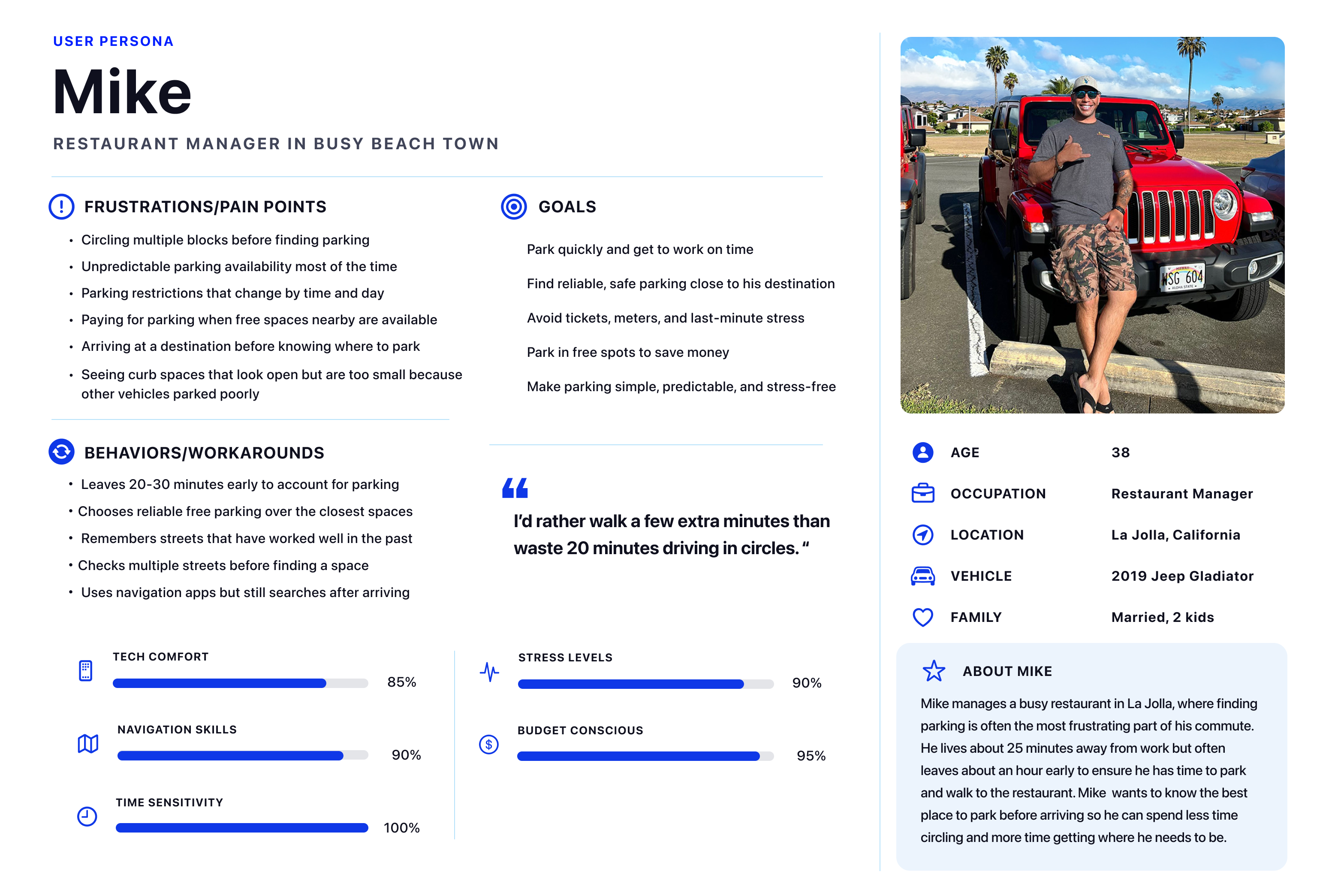
The main themes from the interviews were distilled into a primary persona that represents the shared goals, frustrations, and decision-making patterns observed across participants. It served as a reference point throughout ideation and design.
Lorem ipsum dolor sit amet, consectetur adipiscing elit, sed do eiusmod tempor incididunt ut labore et dolore magna aliqua. Ut enim ad minim veniam, quis nostrud exercitation ullamco laboris nisi ut aliquip ex ea commodo consequat. Duis aute irure dolor in reprehenderit in voluptate velit esse cillum dolore eu fugiat nulla pariatur.
We evaluated six parking platforms to understand....
Lorem ipsum dolor sit amet, consectetur adipiscing elit, sed do eiusmod tempor incididunt ut labore et dolore magna aliqua. Ut enim ad minim veniam, quis nostrud exercitation ullamco laboris nisi ut aliquip ex ea commodo consequat. Duis aute irure dolor in reprehenderit in voluptate velit esse cillum dolore eu fugiat nulla pariatur.
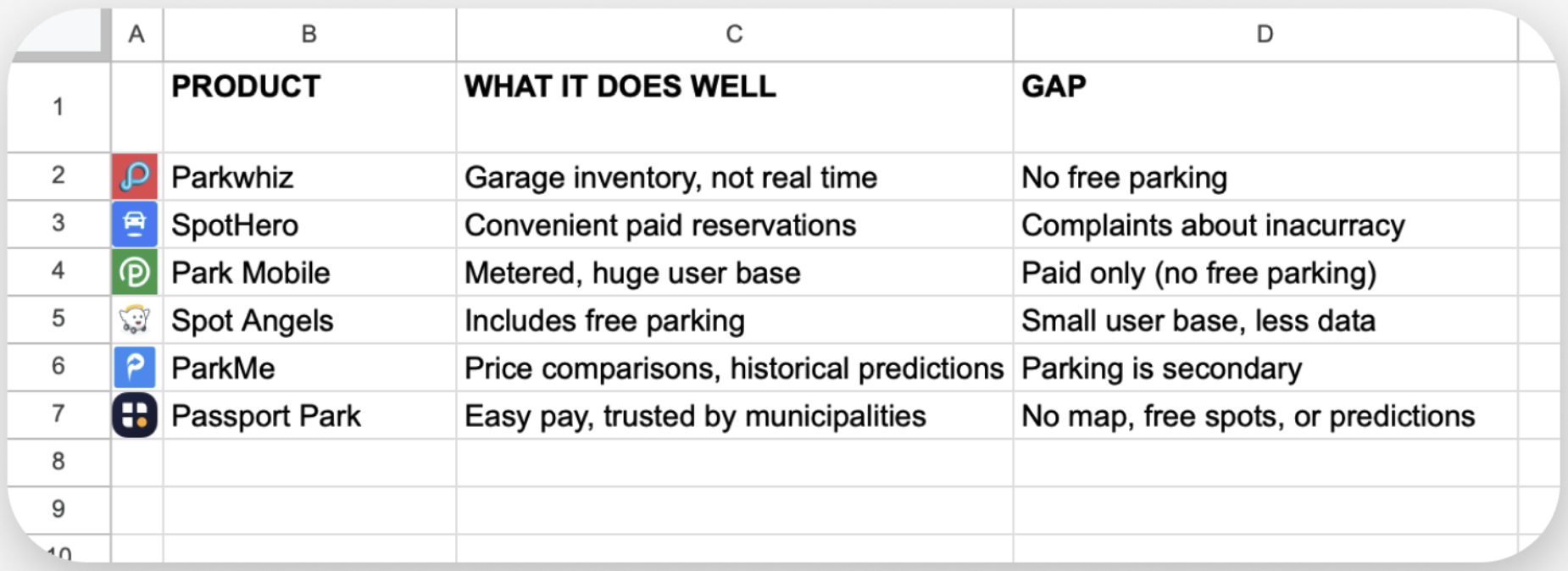
By combining insights from competitive analysis...
Lorem ipsum dolor sit amet, consectetur adipiscing elit, sed do eiusmod tempor incididunt ut labore et dolore magna aliqua. Ut enim ad minim veniam, quis nostrud exercitation ullamco laboris nisi ut aliquip ex ea commodo consequat. Duis aute irure dolor in reprehenderit in voluptate velit esse cillum dolore eu fugiat nulla pariatur.
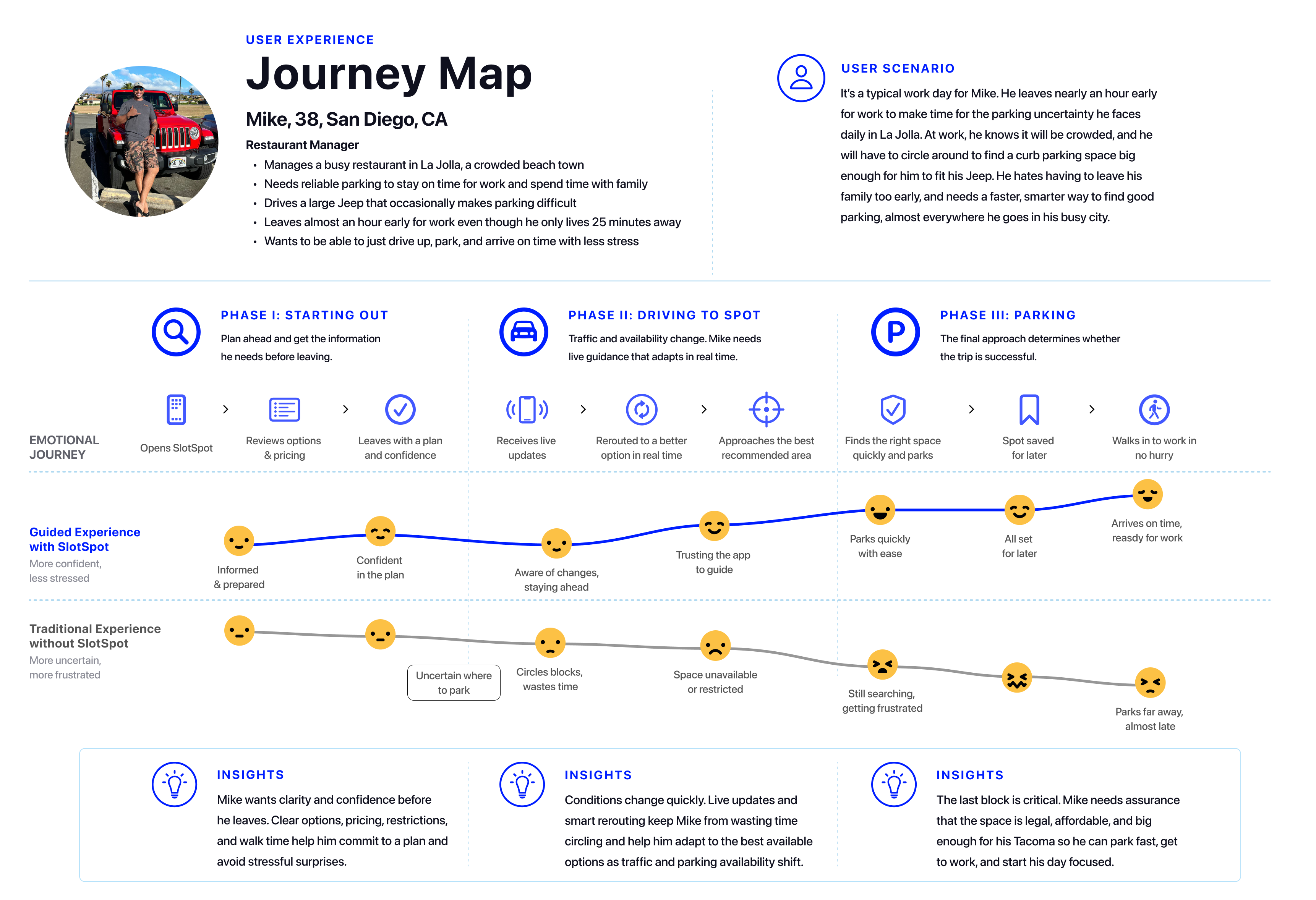
Drivers weren't simply looking for parking, but for predictability, transparency, and confidence.
Research clarified the problem, but the solution came after a deep exploration.
Lorem ipsum dolor sit amet, consectetur adipiscing elit, sed do eiusmod tempor incididunt ut labore et dolore magna aliqua. Ut enim ad minim veniam, quis nostrud exercitation ullamco laboris nisi ut aliquip ex ea commodo consequat. Duis aute irure dolor in reprehenderit in voluptate velit esse cillum dolore eu fugiat nulla pariatur.
Consistent patterns across every interaction.

Straightforward UI, no hidden steps.

Only the essentials, easy decisions.

Consistent design language across flows.
Straightforward UI,
no hidden steps.
Only the essentials,
easy decisions.
Our research indicated that finding available spots in real time before arriving was what drivers needed most. We initially explored technologically advanced concepts to solve this problem, looking into ideas such as park-sharing marketplaces and augmented reality head-up displays. We even began prototyping the latter using sticky notes, AR apps like Adobe Aero, and AI image generation.
Lorem ipsum dolor sit amet, consectetur adipiscing elit, sed do eiusmod tempor incididunt ut labore et dolore magna aliqua. Ut enim ad minim veniam, quis nostrud exercitation ullamco laboris nisi ut aliquip ex ea commodo consequat. Duis aute irure dolor in reprehenderit in voluptate velit esse cillum dolore eu fugiat nulla pariatur.
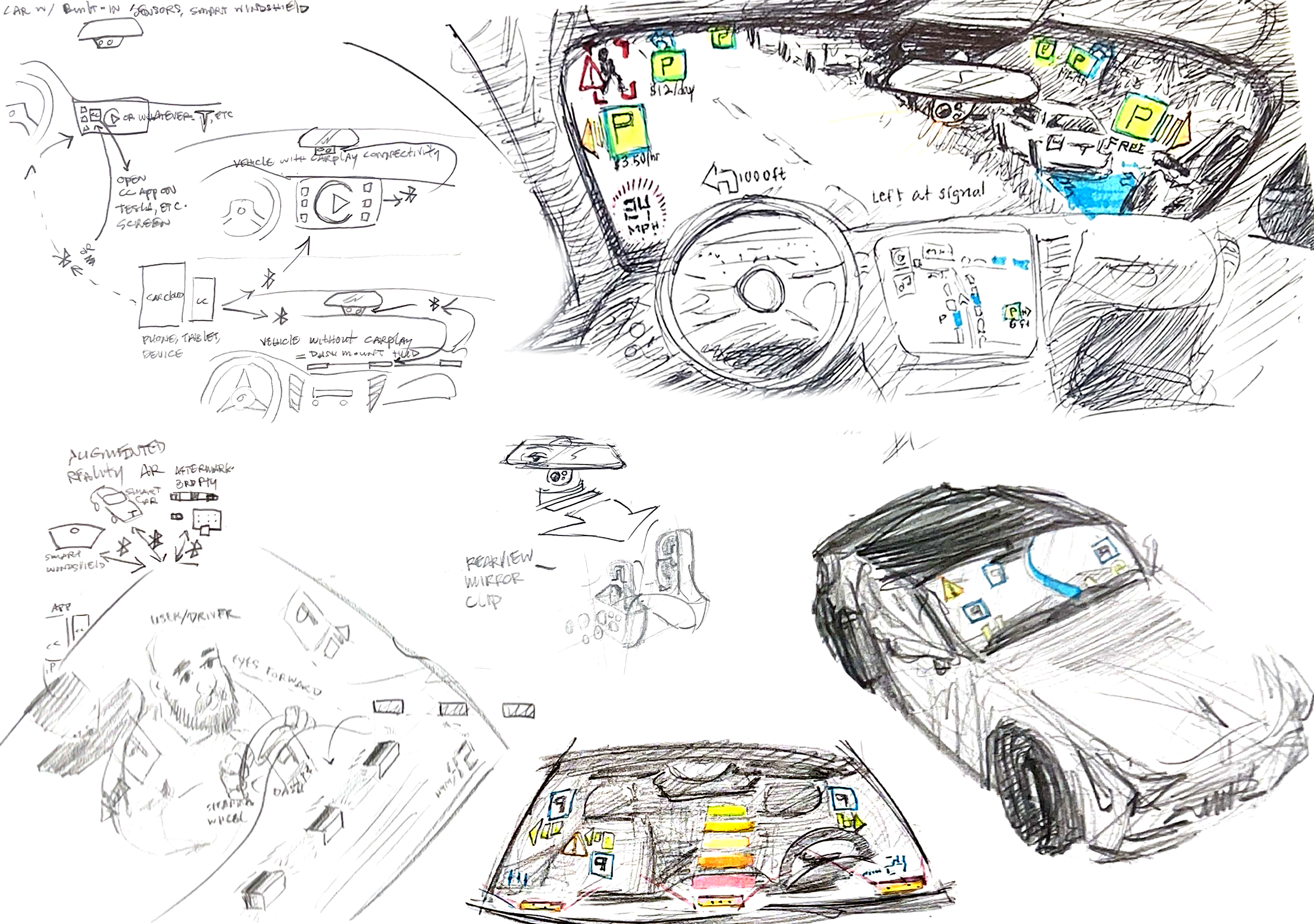
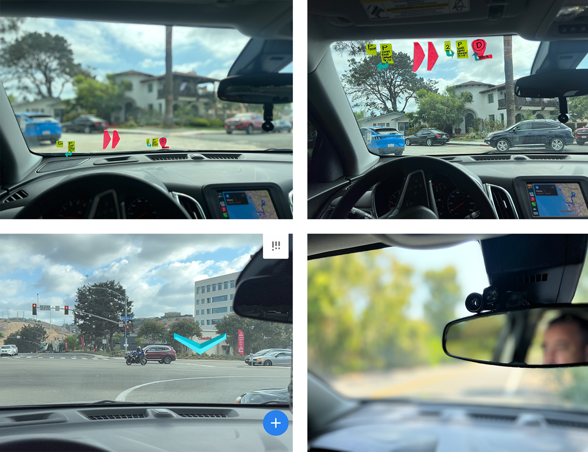

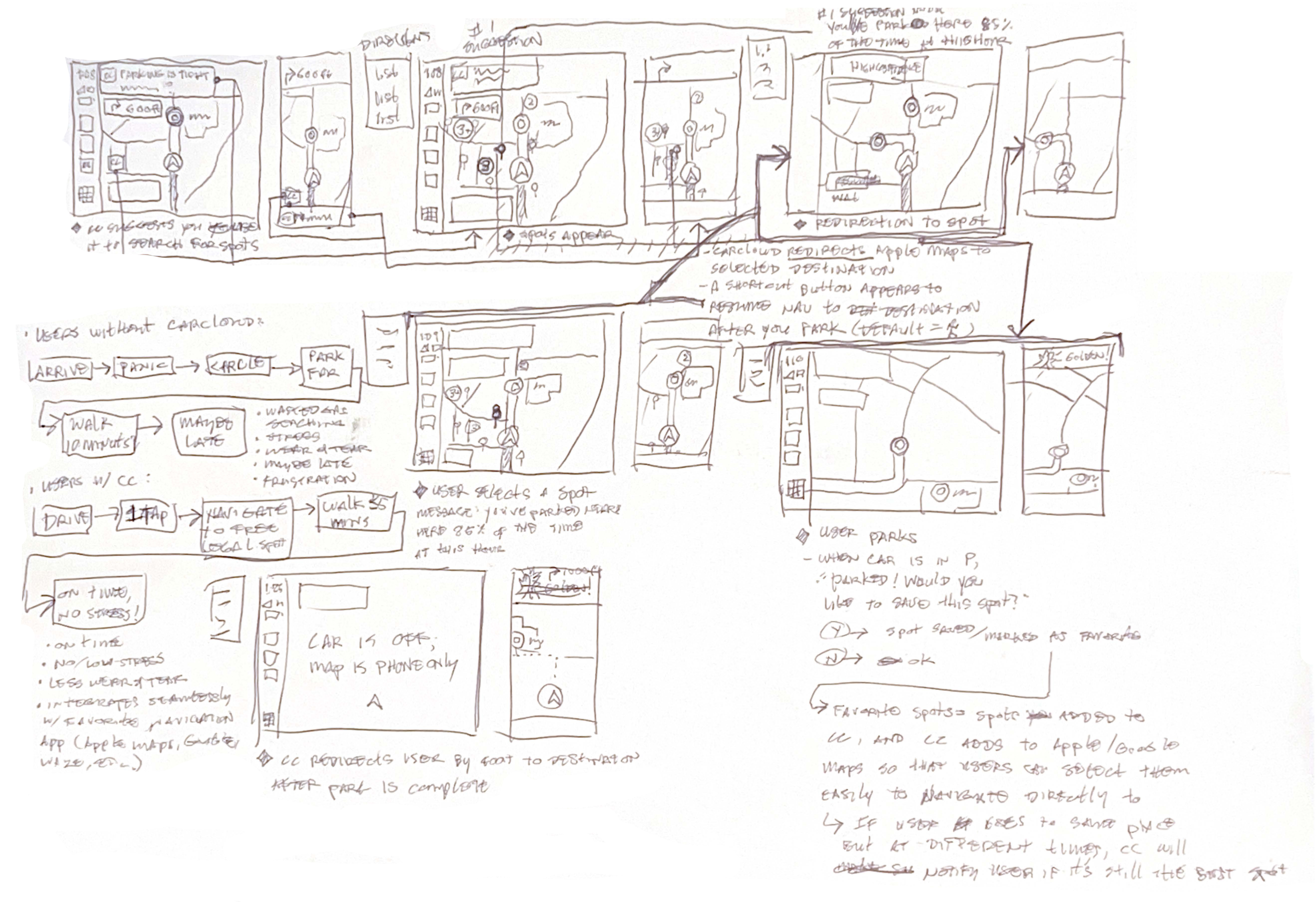
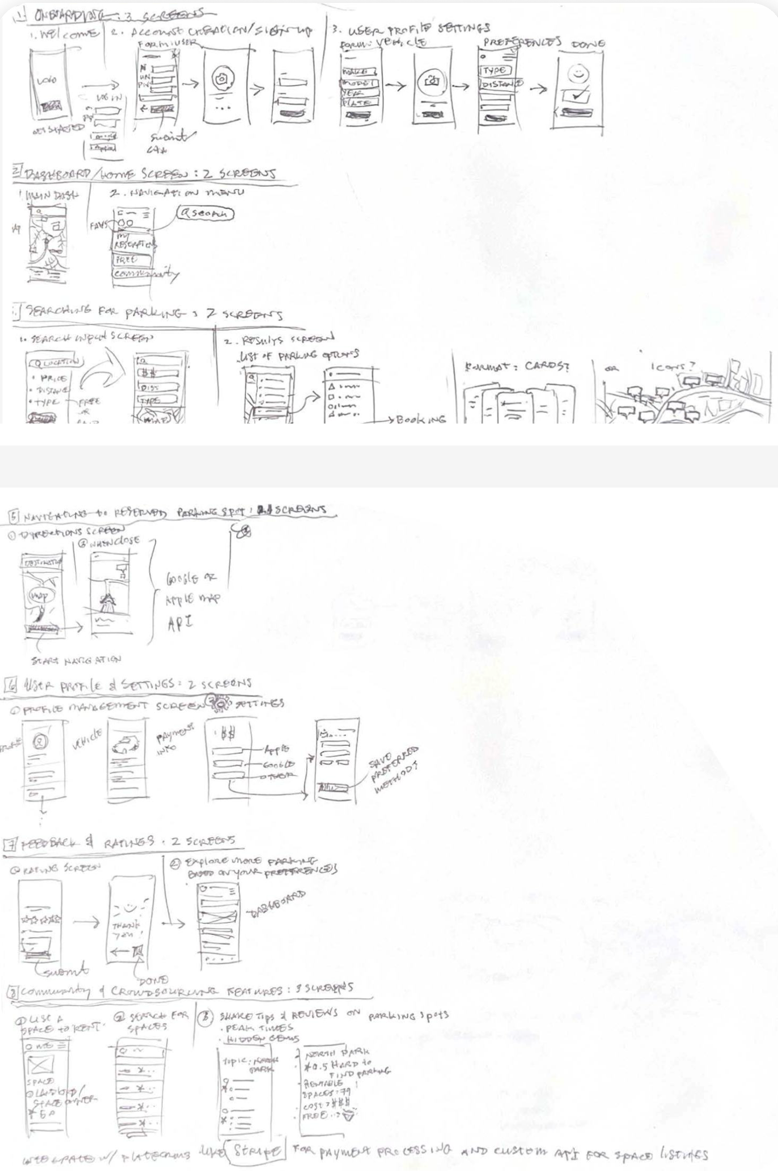
Our augmented reality concepts led to wireframes that displayed a complex system of interactions. During this phase, we also debated the product name, ultimately choosing SlotSpot over Carcloud.
Lorem ipsum dolor sit amet, consectetur adipiscing elit, sed do eiusmod tempor incididunt ut labore et dolore magna aliqua. Ut enim ad minim veniam, quis nostrud exercitation ullamco laboris nisi ut aliquip ex ea commodo consequat. Duis aute irure dolor in reprehenderit in voluptate velit esse cillum dolore eu fugiat nulla pariatur.
Having explored divergent models, we stepped back and evaluated our developing solution, asking, "Will these ideas actually benefit most drivers?" While exciting, our advanced concepts depended on specialized in-vehicle hardware with limited adoption, resulting in high-effort, low-impact outcomes.
Lorem ipsum dolor sit amet, consectetur adipiscing elit, sed do eiusmod tempor incididunt ut labore et dolore magna aliqua. Ut enim ad minim veniam, quis nostrud exercitation ullamco laboris nisi ut aliquip ex ea commodo consequat. Duis aute irure dolor in reprehenderit in voluptate velit esse cillum dolore eu fugiat nulla pariatur.
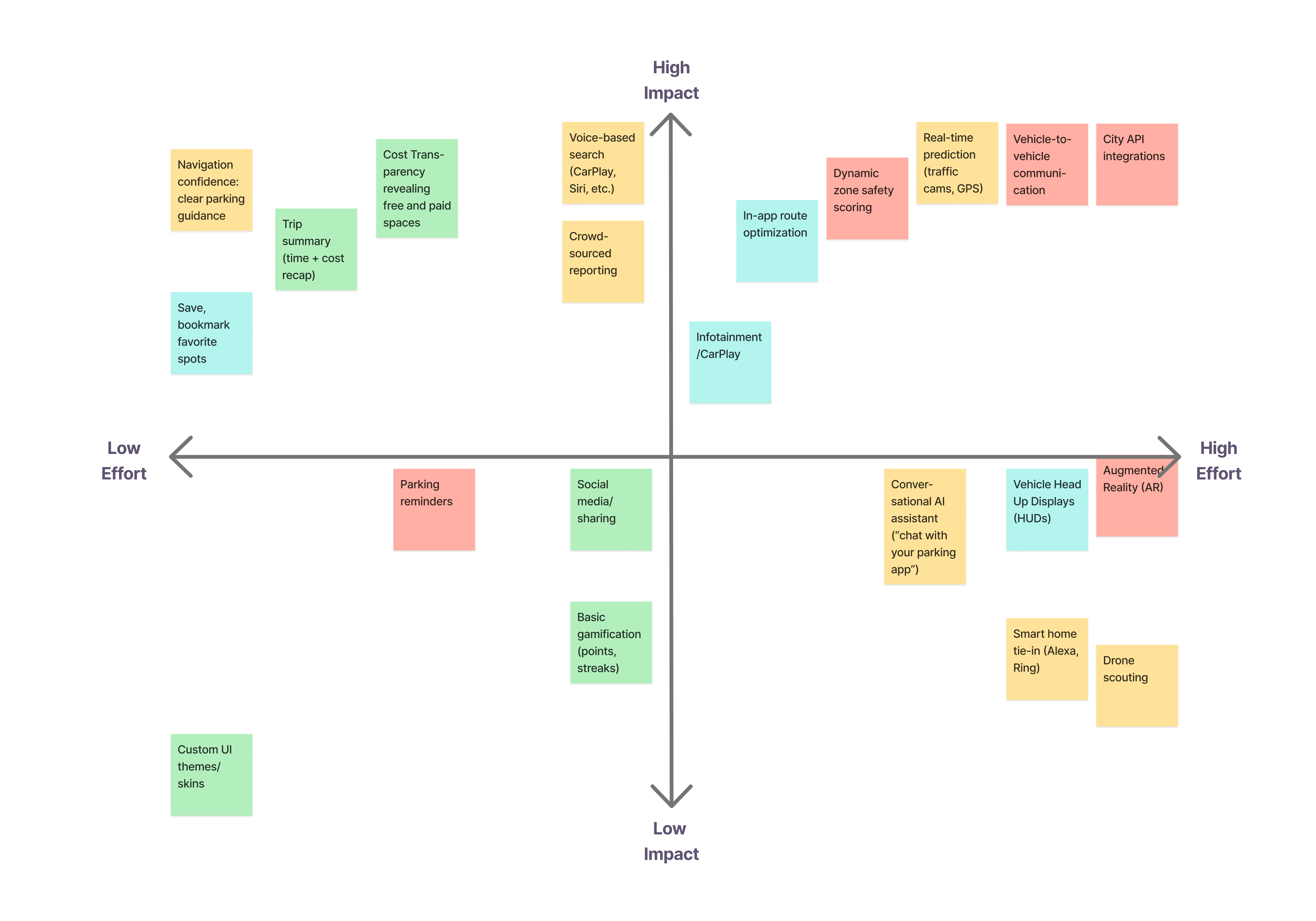
Initial ideas led to problems involving feasibility, safety, and adoption. Instead of forcing ambitious ideas forward, we leaned into those limitations to refine a more practical direction.
Lorem ipsum dolor sit amet, consectetur adipiscing elit, sed do eiusmod tempor incididunt ut labore et dolore magna aliqua. Ut enim ad minim veniam, quis nostrud exercitation ullamco laboris nisi ut aliquip ex ea commodo consequat. Duis aute irure dolor in reprehenderit in voluptate velit esse cillum dolore eu fugiat nulla pariatur.
TECHNICAL
FEASIBILITY
NEW DIRECTION
Prioritize technology people can use today.
DRIVER
SAFETY
NEW DIRECTION
Keep attention on the road through a simpler interface.
ADOPTION
FRICTION
NEW DIRECTION
Design for every driver with a mobile-first experience.
Our divergent design might not be the best solution for the user base.
We explored futuristic concepts like augmented reality and park-sharing, but the more we tested and evaluated them, the more one insight became clear: drivers didn't need more visual complexity, they needed clearer, more trustworthy guidance in a product they already carried every day.
Having decided that our previous concepts weren't compatible with our implementation goals of making a widely used parking solution, we pivoted into a new mobile-first design, salvaging all our previous research, wireframes and design goals.
Lorem ipsum dolor sit amet, consectetur adipiscing elit, sed do eiusmod tempor incididunt ut labore et dolore magna aliqua. Ut enim ad minim veniam, quis nostrud exercitation ullamco laboris nisi ut aliquip ex ea commodo consequat. Duis aute irure dolor in reprehenderit in voluptate velit esse cillum dolore eu fugiat nulla pariatur.
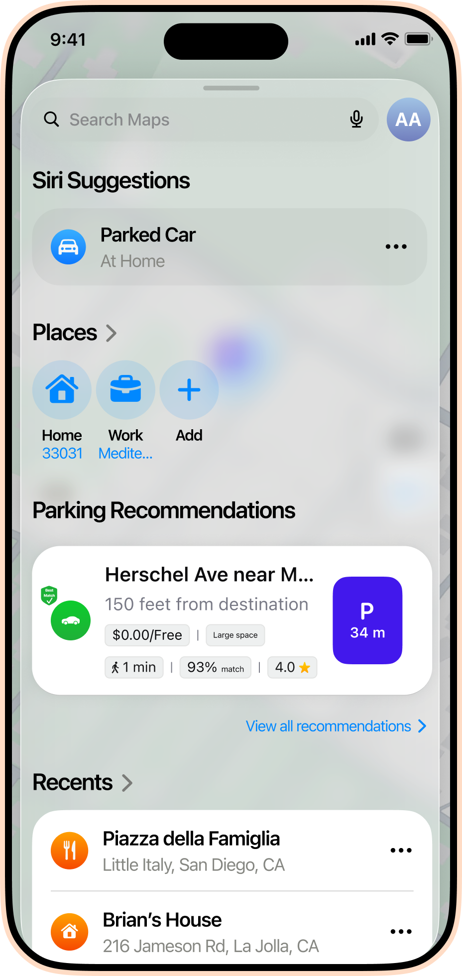
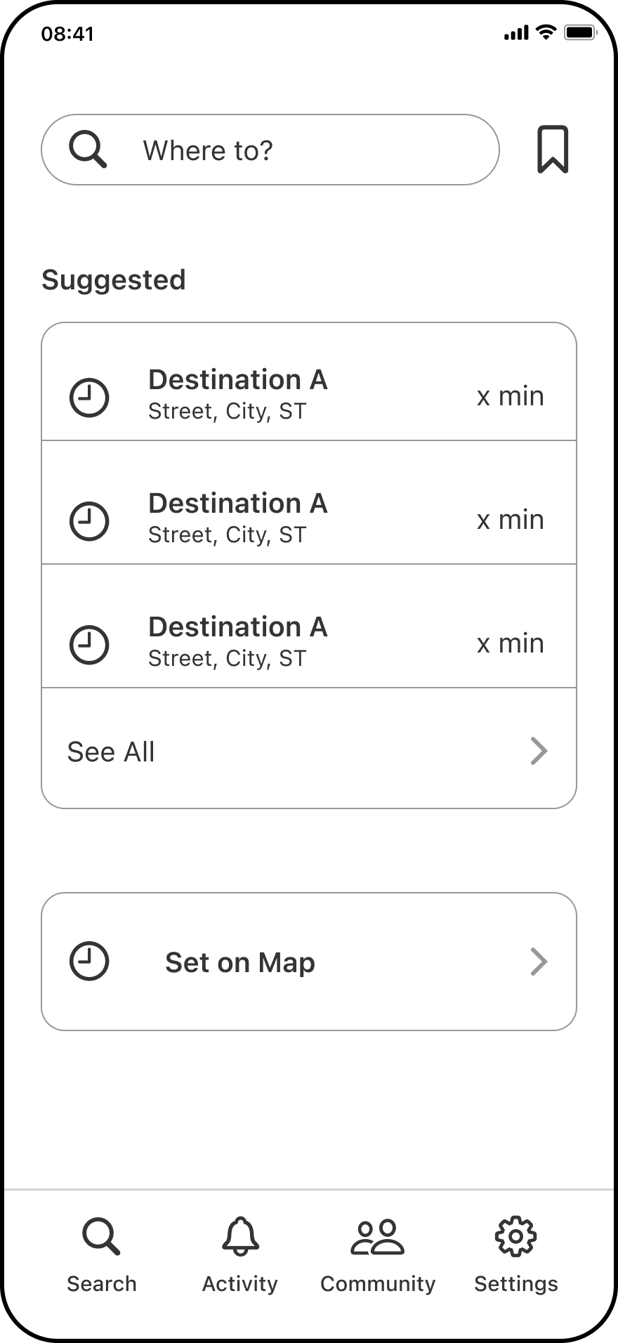
With the platform established, we set out to translate the design we began for the AR concept into a mobile app interface, using inspiration from common wayfinding apps to provide a seamless parking space finding experience.
Lorem ipsum dolor sit amet, consectetur adipiscing elit, sed do eiusmod tempor incididunt ut labore et dolore magna aliqua. Ut enim ad minim veniam, quis nostrud exercitation ullamco laboris nisi ut aliquip ex ea commodo consequat. Duis aute irure dolor in reprehenderit in voluptate velit esse cillum dolore eu fugiat nulla pariatur.
Lorem ipsum dolor sit amet, consectetur adipiscing elit, sed do eiusmod tempor incididunt ut labore et dolore magna aliqua. Ut enim ad minim veniam, quis nostrud exercitation ullamco laboris nisi ut aliquip ex ea commodo consequat. Duis aute irure dolor in reprehenderit in voluptate velit esse cillum dolore eu fugiat nulla pariatur.

The core flow prioritized speed, confidence, and clarity. We explored how SlotSpot could work within iOS Maps for more universal compatibility, as well as how it could surface better parking options in real time, adapt during the drive, and make the outcome clear.
Lorem ipsum dolor sit amet, consectetur adipiscing elit, sed do eiusmod tempor incididunt ut labore et dolore magna aliqua. Ut enim ad minim veniam, quis nostrud exercitation ullamco laboris nisi ut aliquip ex ea commodo consequat. Duis aute irure dolor in reprehenderit in voluptate velit esse cillum dolore eu fugiat nulla pariatur.
START
SEARCH
1. Search a destination or choose a recent trip. Community reporting lets drivers flag spaces as they open up.
COMPARE
OPTIONS
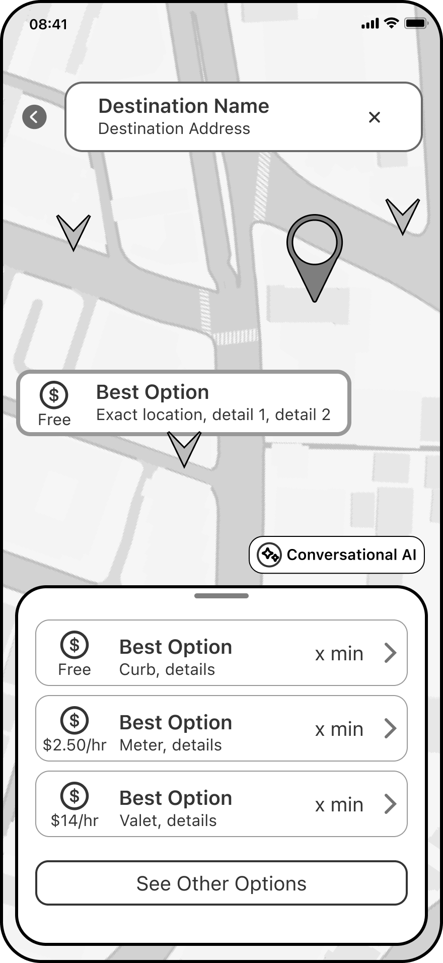
2. Parking markers and ranked options layer into Maps, helping drivers quickly judge distance, cost, and availability.
ADAPT
EN ROUTE
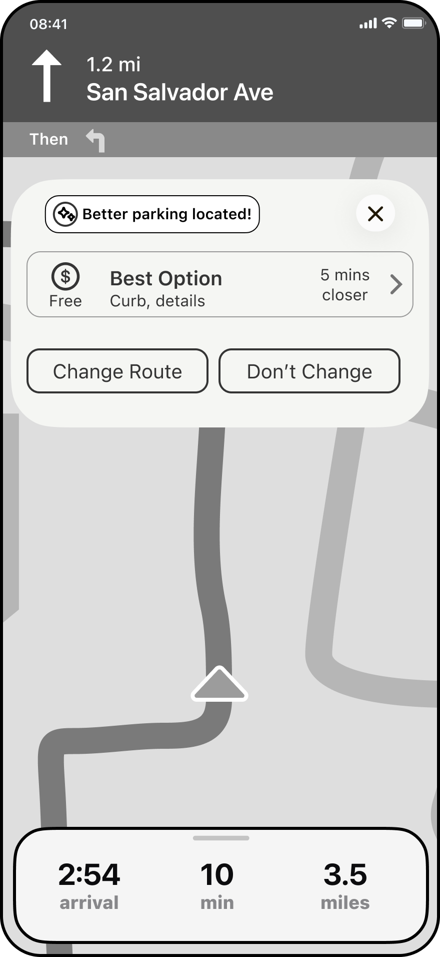
3. Live updates can redirect drivers toward a better parking area when a stronger option appears.
SEE
SAVINGS
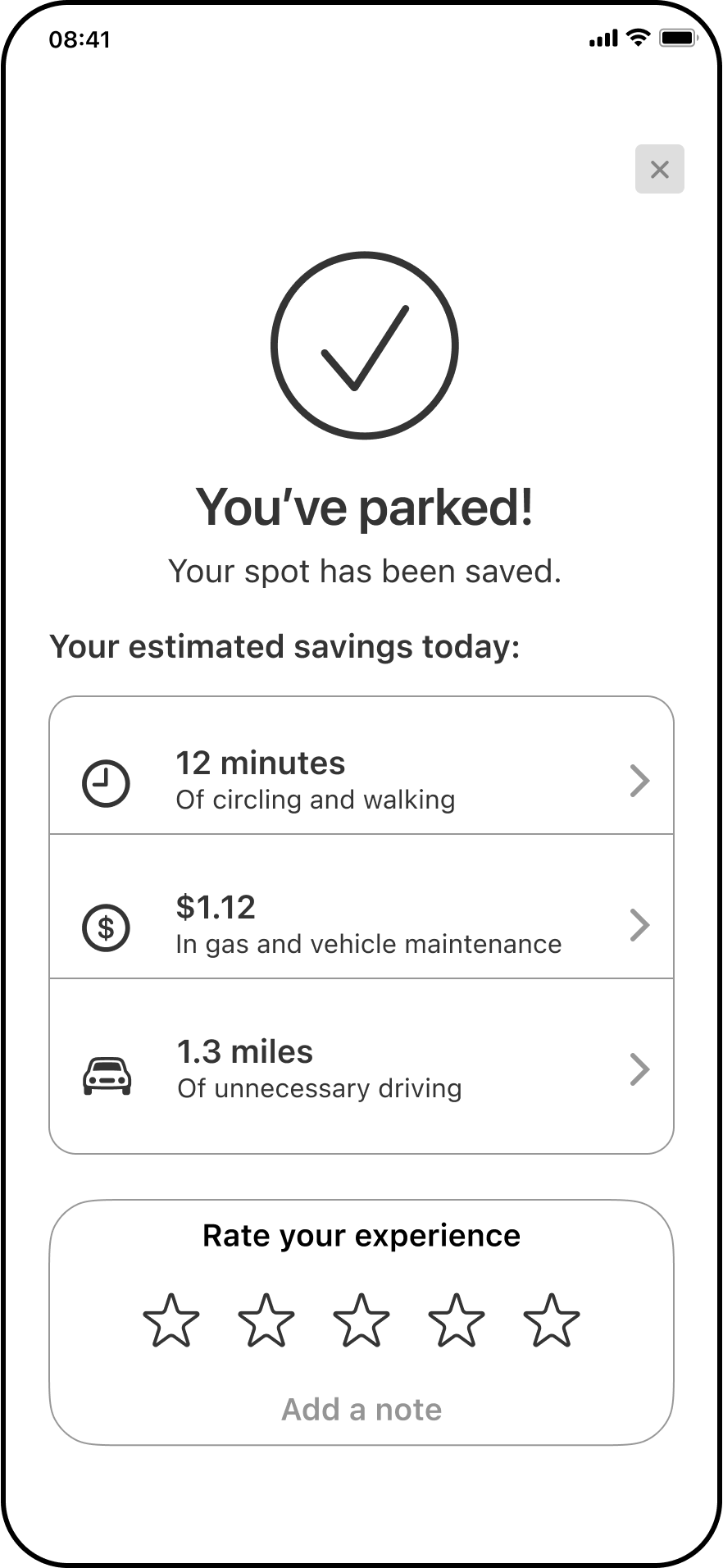
4. After parking, SlotSpot shows the estimated time, money, and unnecessary driving saved.
Moving away from augmented reality forced us to simplify the experience without sacrificing its usefulness. Rather than projecting open parking spaces on high-tech windshields, we translated SlotSpot to surface individual opportunities as they become relevant onto the map's UI, guiding drivers toward better decisions one small moment at a time.
Lorem ipsum dolor sit amet, consectetur adipiscing elit, sed do eiusmod tempor incididunt ut labore et dolore magna aliqua. Ut enim ad minim veniam, quis nostrud exercitation ullamco laboris nisi ut aliquip ex ea commodo consequat. Duis aute irure dolor in reprehenderit in voluptate velit esse cillum dolore eu fugiat nulla pariatur.
As the app evolved, I explored increasingly expressive directions for Gutsy, testing color, interface density, navigation, typography, and personality along the way. Gradually, those pieces came together into an energetic visual system that made complex health information feel clearer, friendlier, and more approachable.
Lorem ipsum dolor sit amet, consectetur adipiscing elit, sed do eiusmod tempor incididunt ut labore et dolore magna aliqua. Ut enim ad minim veniam, quis nostrud exercitation ullamco laboris nisi ut aliquip ex ea commodo consequat. Duis aute irure dolor in reprehenderit in voluptate velit esse cillum dolore eu fugiat nulla pariatur.
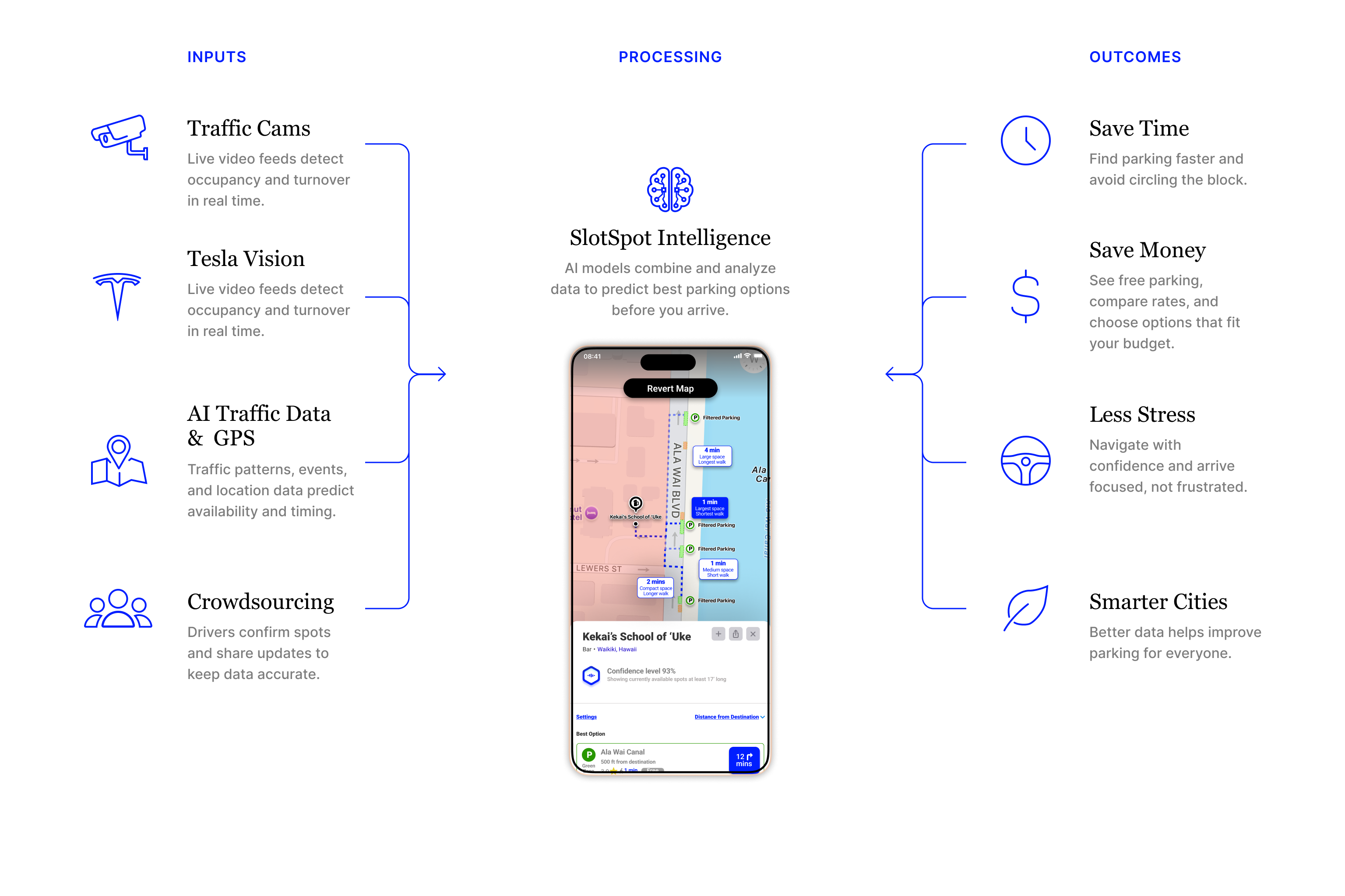
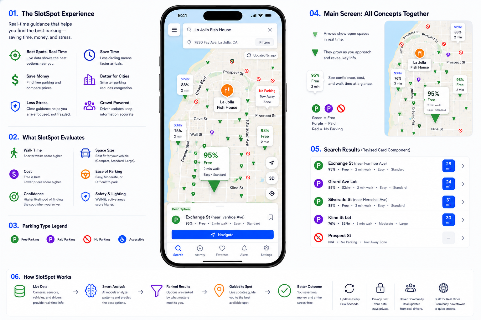
It was important for us to come up with a visual system that communicated parking availability through multiple visual and aural cues, rather than just by color alone. Confidence levels combine color, shape, labels, and hierarchy for drivers with varying vision abilities and accessibility needs. Voice features were also prioritized for visual challenges, as well as safety.
Lorem ipsum dolor sit amet, consectetur adipiscing elit, sed do eiusmod tempor incididunt ut labore et dolore magna aliqua. Ut enim ad minim veniam, quis nostrud exercitation ullamco laboris nisi ut aliquip ex ea commodo consequat. Duis aute irure dolor in reprehenderit in voluptate velit esse cillum dolore eu fugiat nulla pariatur.
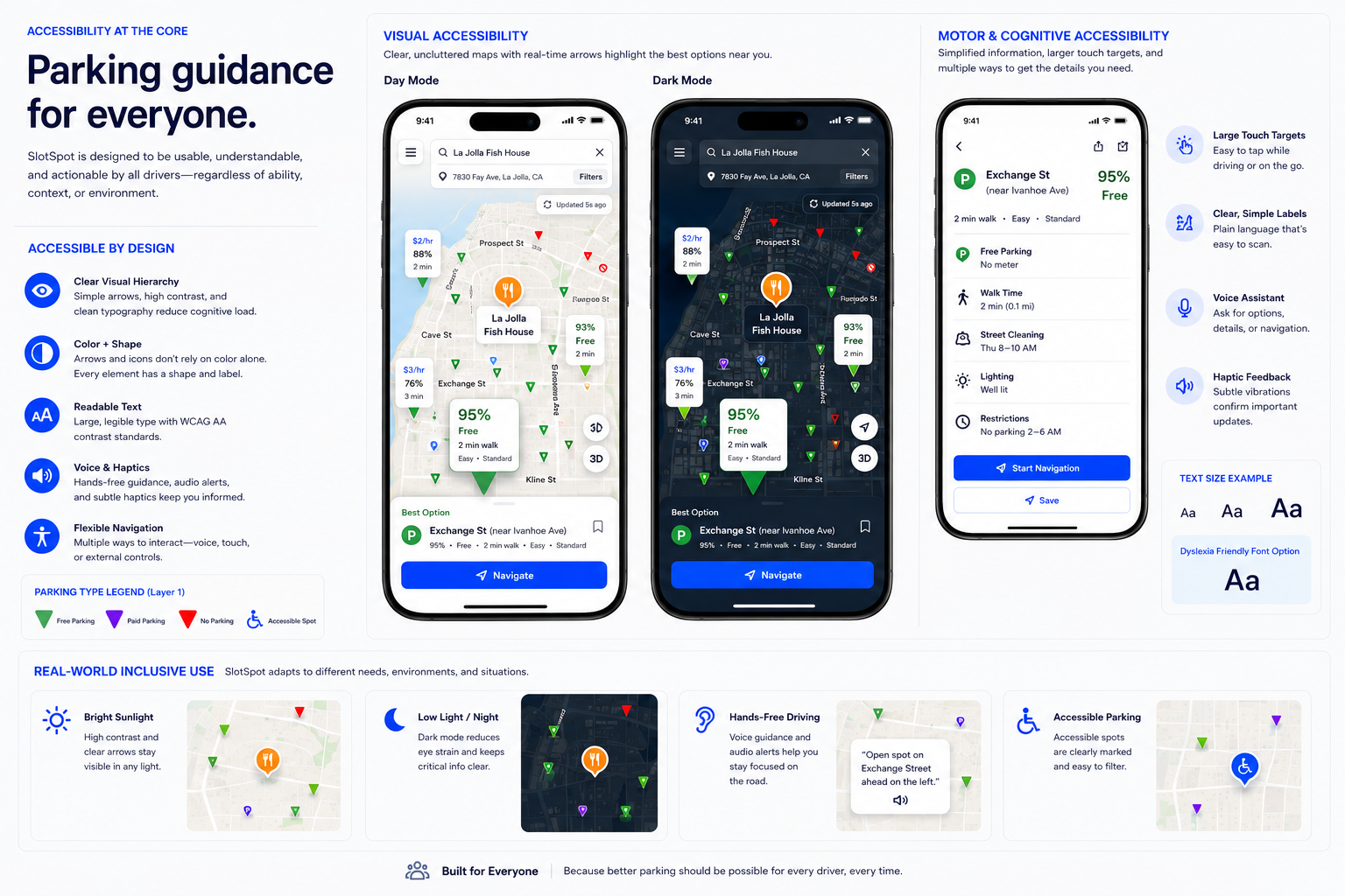
Rather than simply showing where parking exists, we developed SlotSpot to visualize the entire parking environment in real time. Color and text communicate parking type, confidence levels predict likely availability, and larger markers highlight the strongest recommendations, helping drivers to make informed decisions before reaching their destination.
Lorem ipsum dolor sit amet, consectetur adipiscing elit, sed do eiusmod tempor incididunt ut labore et dolore magna aliqua. Ut enim ad minim veniam, quis nostrud exercitation ullamco laboris nisi ut aliquip ex ea commodo consequat. Duis aute irure dolor in reprehenderit in voluptate velit esse cillum dolore eu fugiat nulla pariatur.
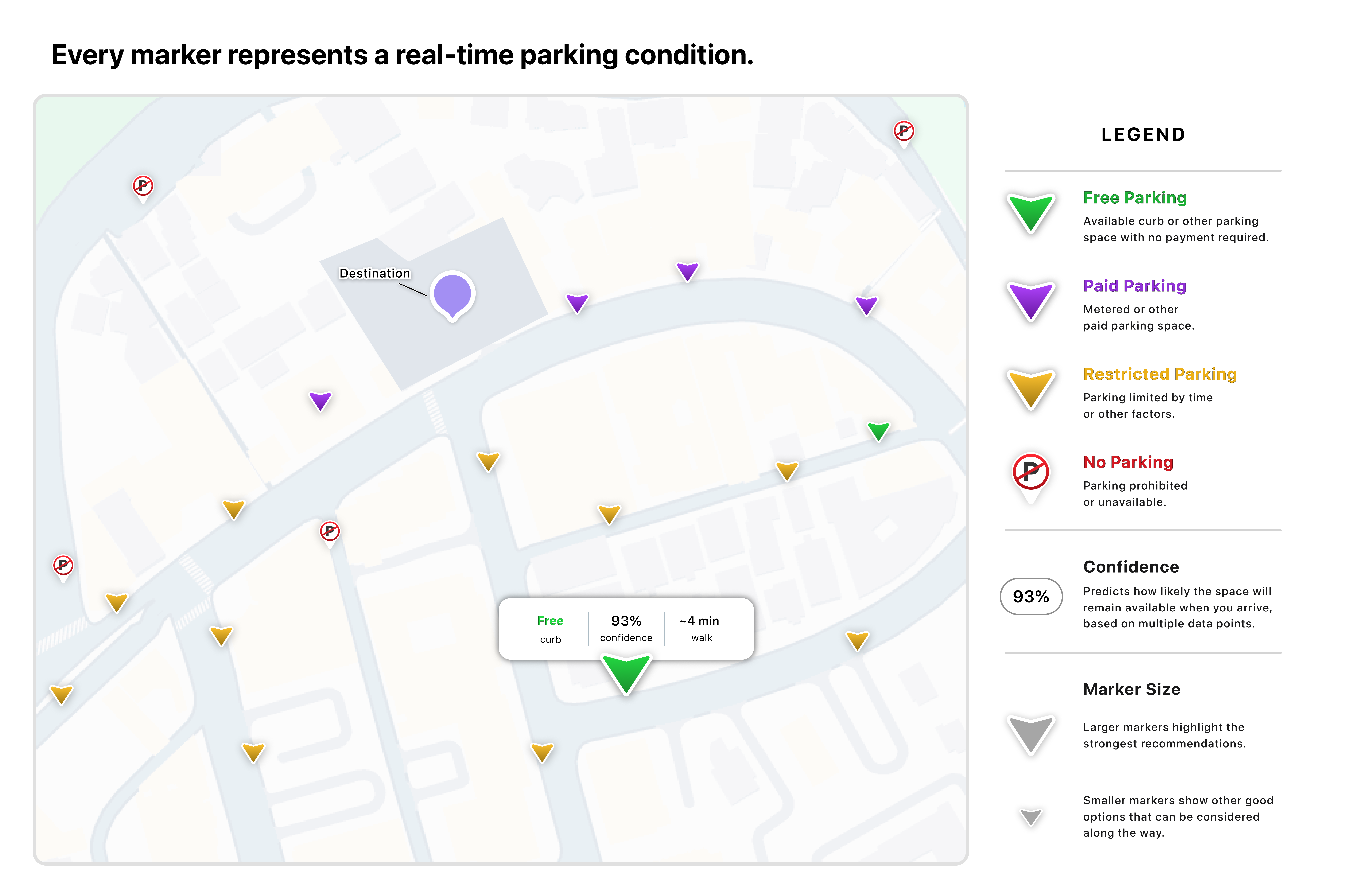
We redesigned with intent, prioritizing intuitive affordances and accessibility for an optimal user experience.
Sharing the prototype with prospective users revealed what felt intuitive, where uncertainty remained, and which ideas deserved another iteration.
We looked for recurring themes throughout our potential users' evaluation.
Lorem ipsum dolor sit amet, consectetur adipiscing elit, sed do eiusmod tempor incididunt ut labore et dolore magna aliqua. Ut enim ad minim veniam, quis nostrud exercitation ullamco laboris nisi ut aliquip ex ea commodo consequat. Duis aute irure dolor in reprehenderit in voluptate velit esse cillum dolore eu fugiat nulla pariatur.
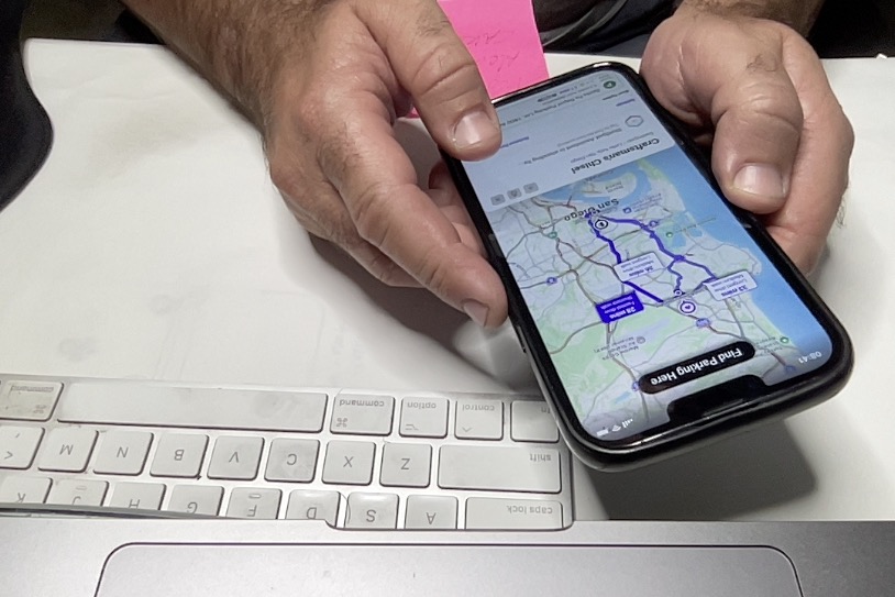
Participants responded positively to the concept in general, but their
feedback consistently centered on confidence, transparency, and clarity. These themes guided the next iteration.
Lorem ipsum dolor sit amet, consectetur adipiscing elit, sed do eiusmod tempor incididunt ut labore et dolore magna aliqua. Ut enim ad minim veniam, quis nostrud exercitation ullamco laboris nisi ut aliquip ex ea commodo consequat. Duis aute irure dolor in reprehenderit in voluptate velit esse cillum dolore eu fugiat nulla pariatur.
CONFIDENCE
How do I know the prediction that the app makes is accurate?
NEW DIRECTION
Prioritize technology people can use today.
TRANSPARENCY
I like seeing the parking costs before I arrive, especially for the free spots.
NEW DIRECTION
Keep attention on the road through a simpler interface.
CLARITY
What if someone takes the spot you're being led to as you're on your way?
NEW DIRECTION
Design for every driver with a mobile-first experience.
Users provided valuable insight from our first prototype that are directing our next round of iterations.
The experience centers on three moments: finding parking, arriving with confidence, and understanding cost before committing.

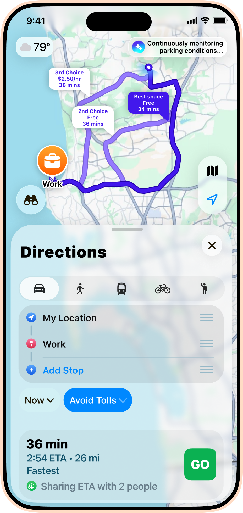
The interface overlays over iOS Maps, for a familiar experience with minimal learning curve.
Once you park, the app generates estimated savings in time, cost, and unnecessary driving, which it remembers and adds up over a long period.

SlotSpot calculates the best parking based on multiple variables, predictions, and real-time camera updates. If your spot is taken as you're on your way, the app updates to route you to the next best option.
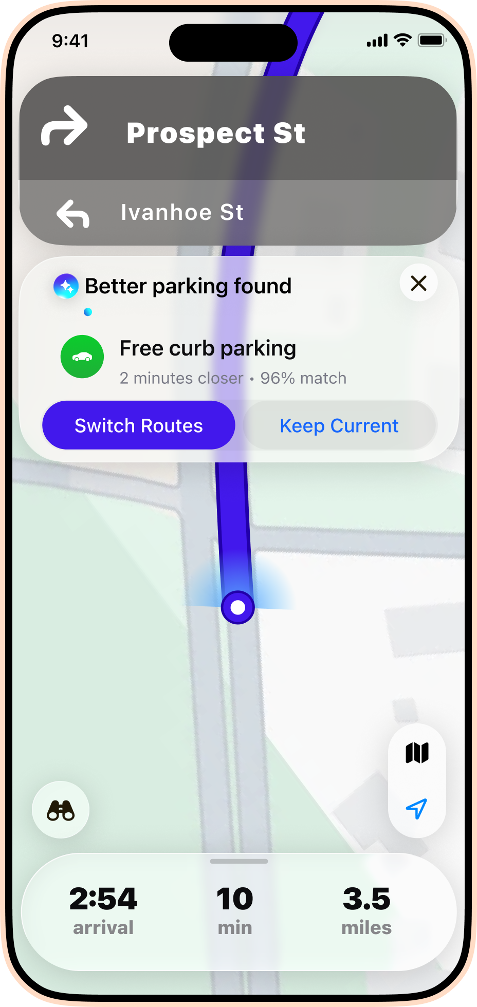
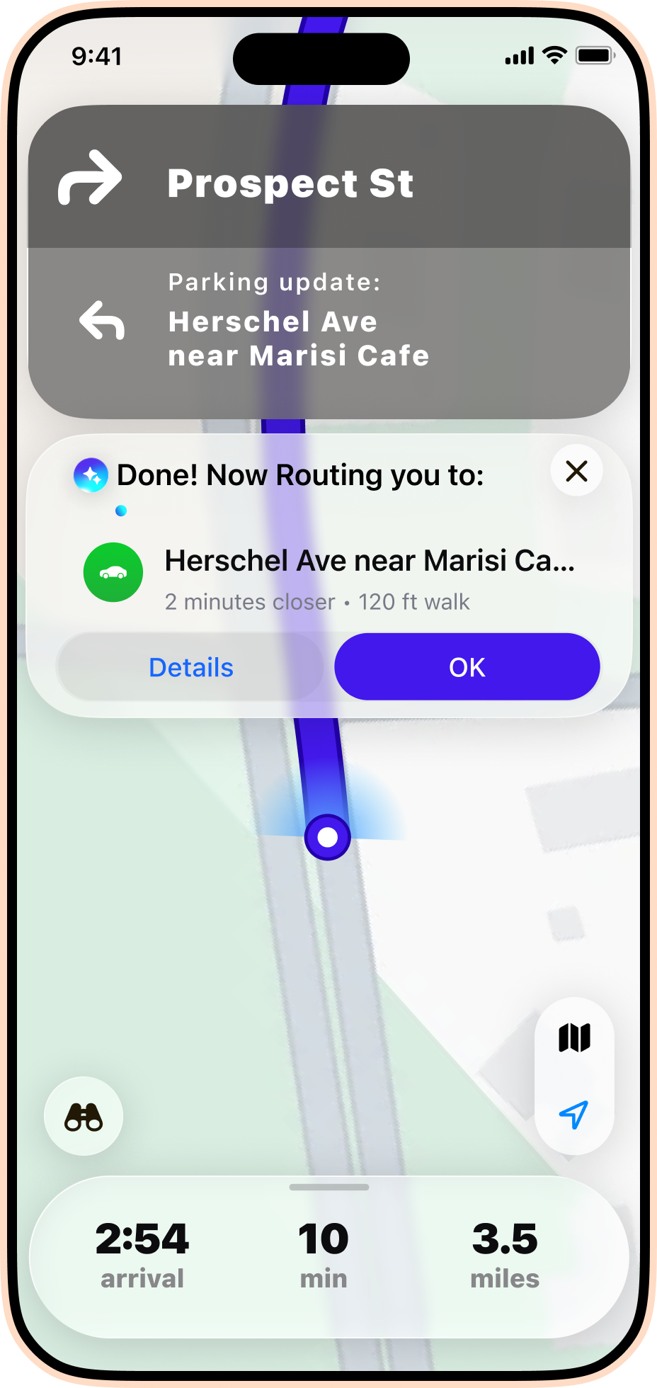
Explore the complete parking journey, from destination search through parking recommendations, navigation, and arrival.
Gutsy’s next challenge involves proving that the patterns it surfaces are reliable, understandable, and useful enough to inform everyday health decisions.
Lorem ipsum dolor sit amet, consectetur adipiscing elit, sed do eiusmod tempor incididunt ut labore et dolore magna aliqua. Ut enim ad minim veniam, quis nostrud exercitation ullamco laboris nisi ut aliquip ex ea commodo consequat. Duis aute irure dolor in reprehenderit in voluptate velit esse cillum dolore eu fugiat nulla pariatur.



Gutsy began as a way to help people track the many factors surrounding chronic illness. Designing it revealed a more important challenge: helping people recognize meaningful patterns without overwhelming them or overstating what the data can prove.
Our ambitious vision of parking's future evolved into a practical concept to be used by everyone.
Have a project, opportunity, or conversation in mind? I'd love to hear from you.