
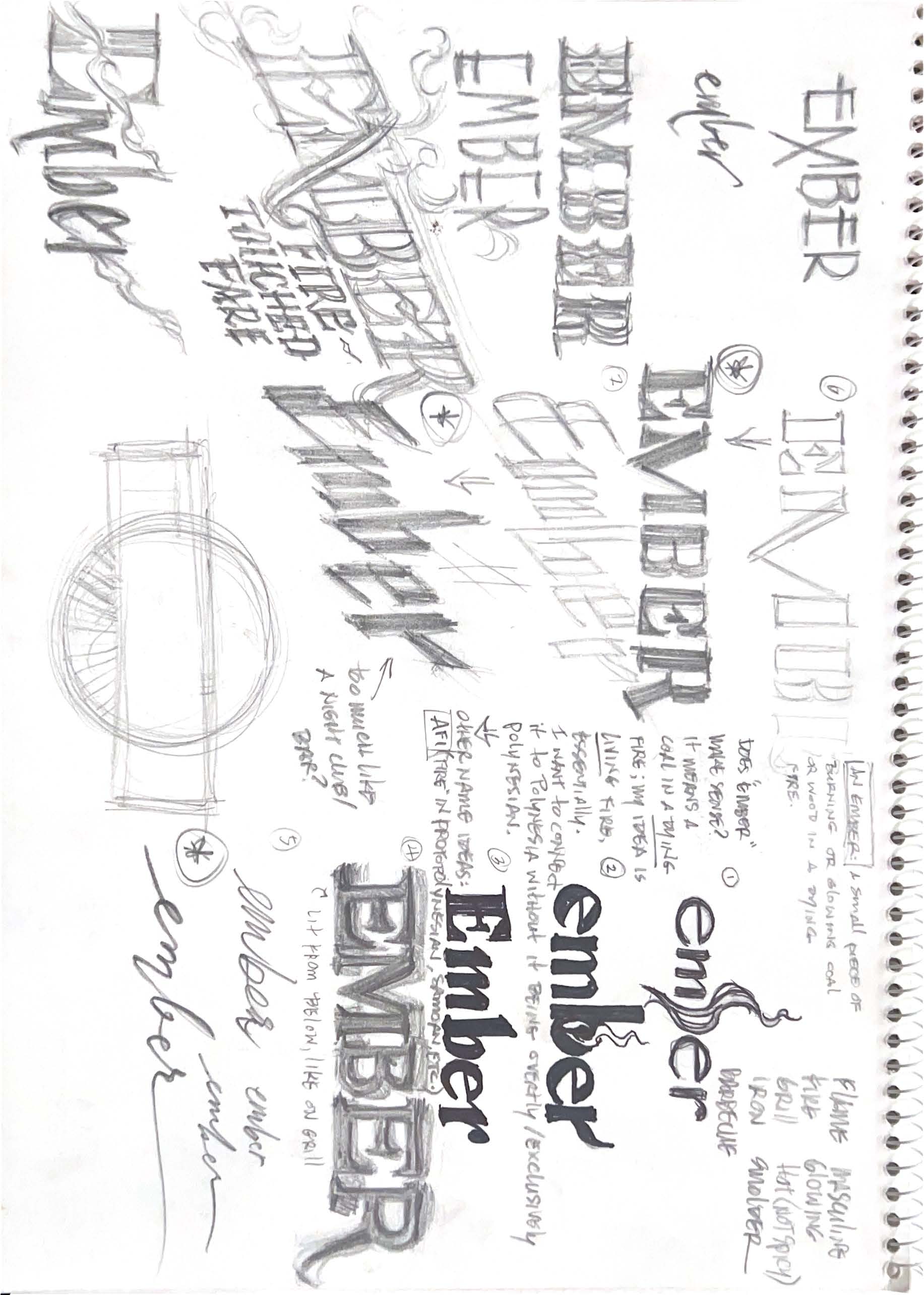
Drawn to traditional, hands-on arts like metal forging, I wanted the brand to feel raw, primal, and rooted in craft. Early on, I knew fire would play a central role — symbolizing heat, labor, and the smokiness of whiskey. I explored dozens of names, styles, and visual directions before landing on Firescale, a nod to the flakes that fall from forged metal. This became the foundation for a subtle backstory woven into every brand touchpoint.
Firescale
A smoky and peaty American whiskey brand promoting blacksmithing, tradition, and rebellion against the synthetic.

Introduction
Firescale is a self-initiated branding project rooted in American craftsmanship, created as a counterpoint to mass-produced, impersonal goods. It channels the grit of blacksmithing into a smoky whiskey brand through bold concept work, tactile design, and handcrafted execution.
My Role
Lead Designer and Creative Director — responsible for concept development, brand strategy, identity design, packaging, and production prep. Managed every stage from sketch ideation to final label production, blending traditional craftsmanship principles with modern brand storytelling.
Project Scope
Concept development, brand story, logo + typography exploration, label and packaging design, bottle styling, studio and social photography, social launch assets
Tools
Hand-drawn sketches, paper prototyping, laser printer, Illustrator, Photoshop, Lightroom, DSLR photography, AI for lighting and environmental mockups
Brand Foundation
A brand born to honor real craftsmanship in a mass-produced world.
Firescale was created to champion real craftsmanship in a world of mass-produced uniformity. Rooted in blacksmithing tradition, the brand stands for grit, skill, and the beauty of the handmade. Just as metal is shaped under fire, the process shapes the maker — and the falling fire scales mark every step of that transformation.
Built for men who believe that skill, sweat, and tradition still matter.
$345
Average annual cost per driver spent searching for parking
63%
Drivers who have avoided trips due to parking difficulties
17hrs
Time the average driver spends annually searching for a spot
9/10
Drivers report feeling stress or anxiety while parking

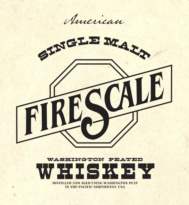
Brand photo of Firescale's front label.
The Process
The challenge: create a beverage brand that represents rebellion against a modern issue. I chose technology.
Concept & Naming

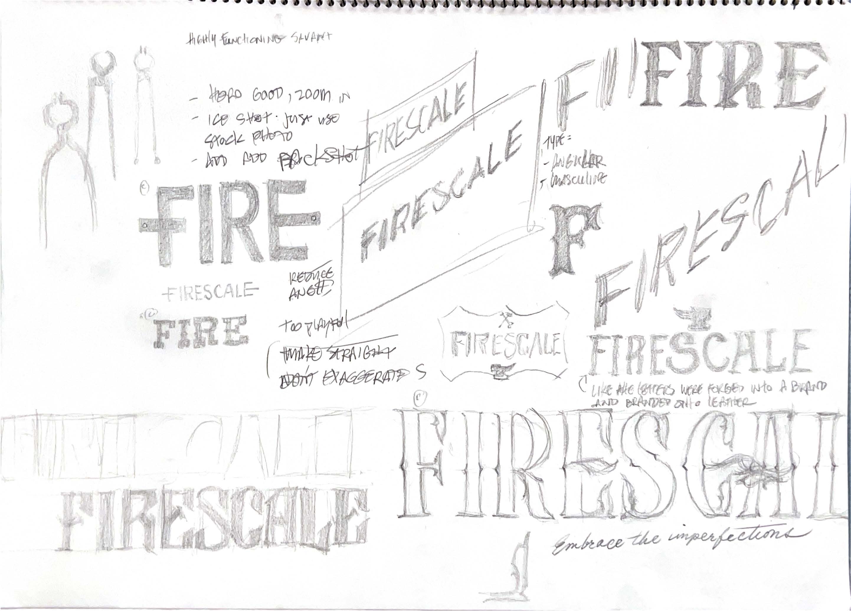
Logo & Typography Exploration
A logo crafted for the worker, the craftsman, and the tradition keeper.
After rounds of designer feedback, I refined the Firescale logo to be scalable, single-color, and rooted in blacksmithing’s visual language. I explored everything from typography-centric, to crest, to illustration in order to develop the brand.


Digital Logo
- I originally liked the idea of a crest for the logo, and went fairly far into the design before realizing it didn't fit the feel for the brand. Translating my hand sketches into vectors also revealed the difficulties in making the type and crest lock up coherently. It was a good exploration though, and I learned a lot about typography in this case study.

Label Iterations
- I made very simple label mockups with different iterations of the logo on it, and finally settled on a much more simplified version that used a heavily modified Noe Display font with a gestalt hammer substituting the left leg in the 'A.'

Bottle & Label Design
Packaging and materials that embody the brand’s handmade ethos.
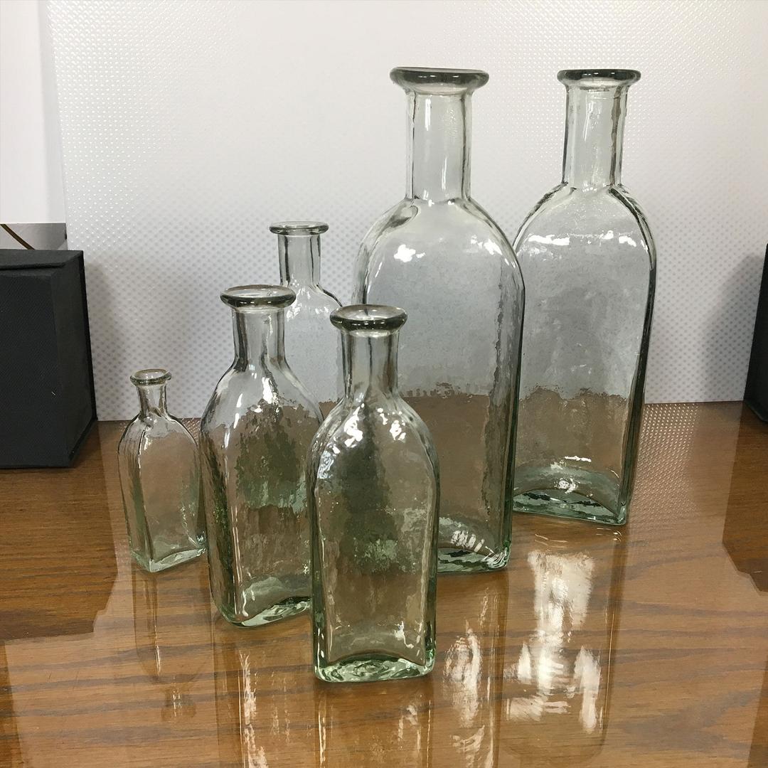
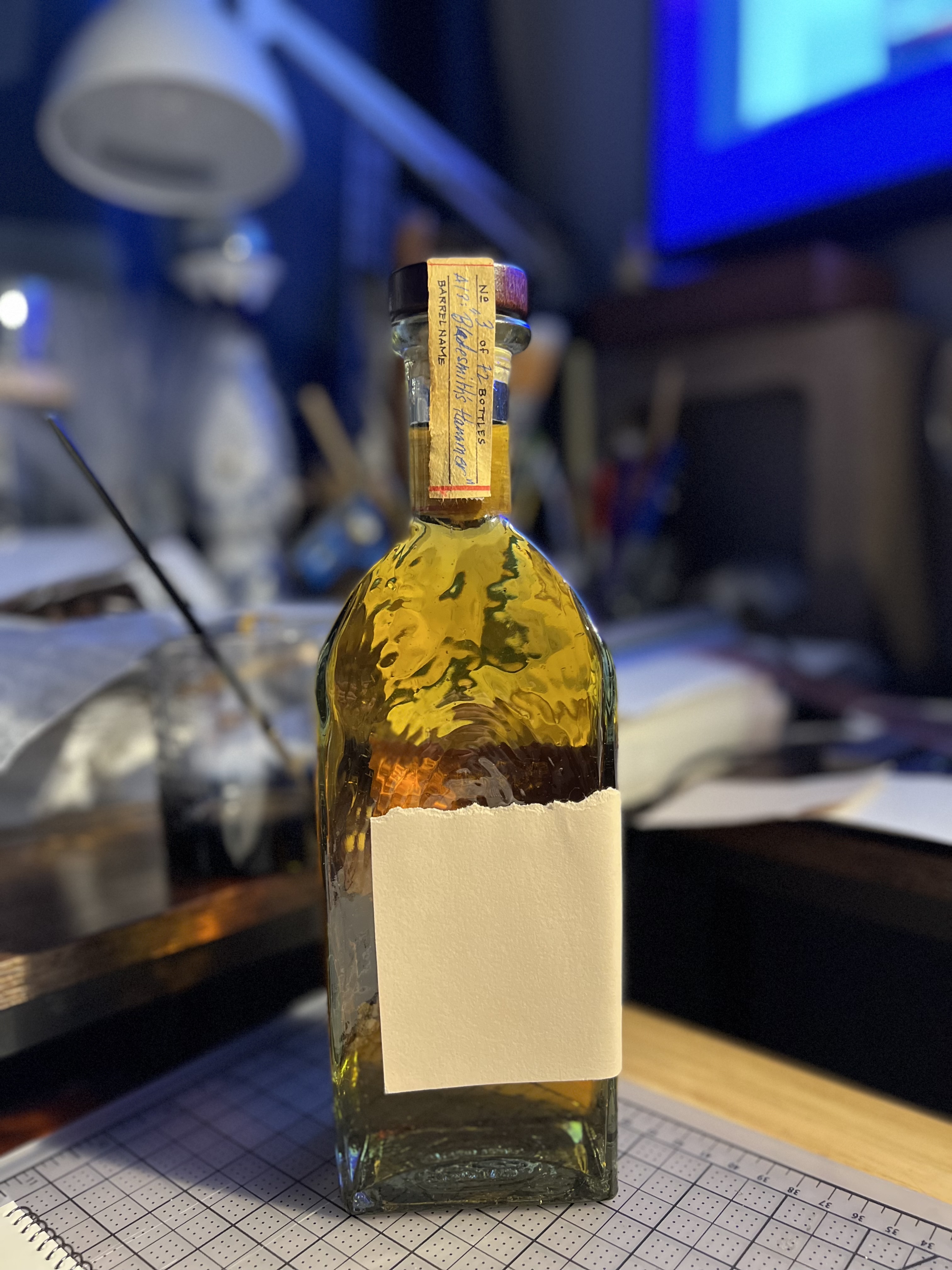
With the concept and name in place, I explored bottle forms that could extend the brand story, from canteens and flasks to carabiner-equipped designs. Each iteration tied to themes of the outdoors, masculine tradition, and hand craftsmanship. I ultimately chose a handblown bottle paired with paper and wood labeling. Its imperfections and tactile feel perfectly reflected Firescale’s handmade ethos.

Quick Mockup
- I played around in Photoshop to render a quick mockup of the early stages of the label on a flask to explore the feel. For probably obvious reasons, I moved onto a different substrate (and refined my Ps skills...).
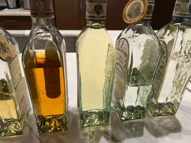
The handblown glass Fortaleza tequila bottle worked perfectly. Photo credit: LikePinningSplates
I obtained a 750mL Fortaleza bottle and got to work. Photo credit: Worth Point
Packaging Mockups
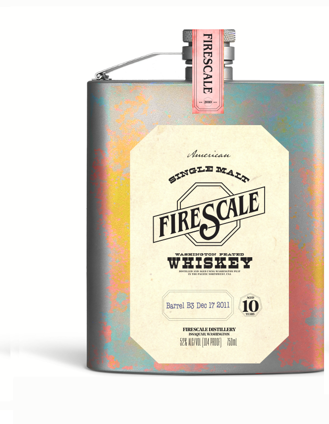
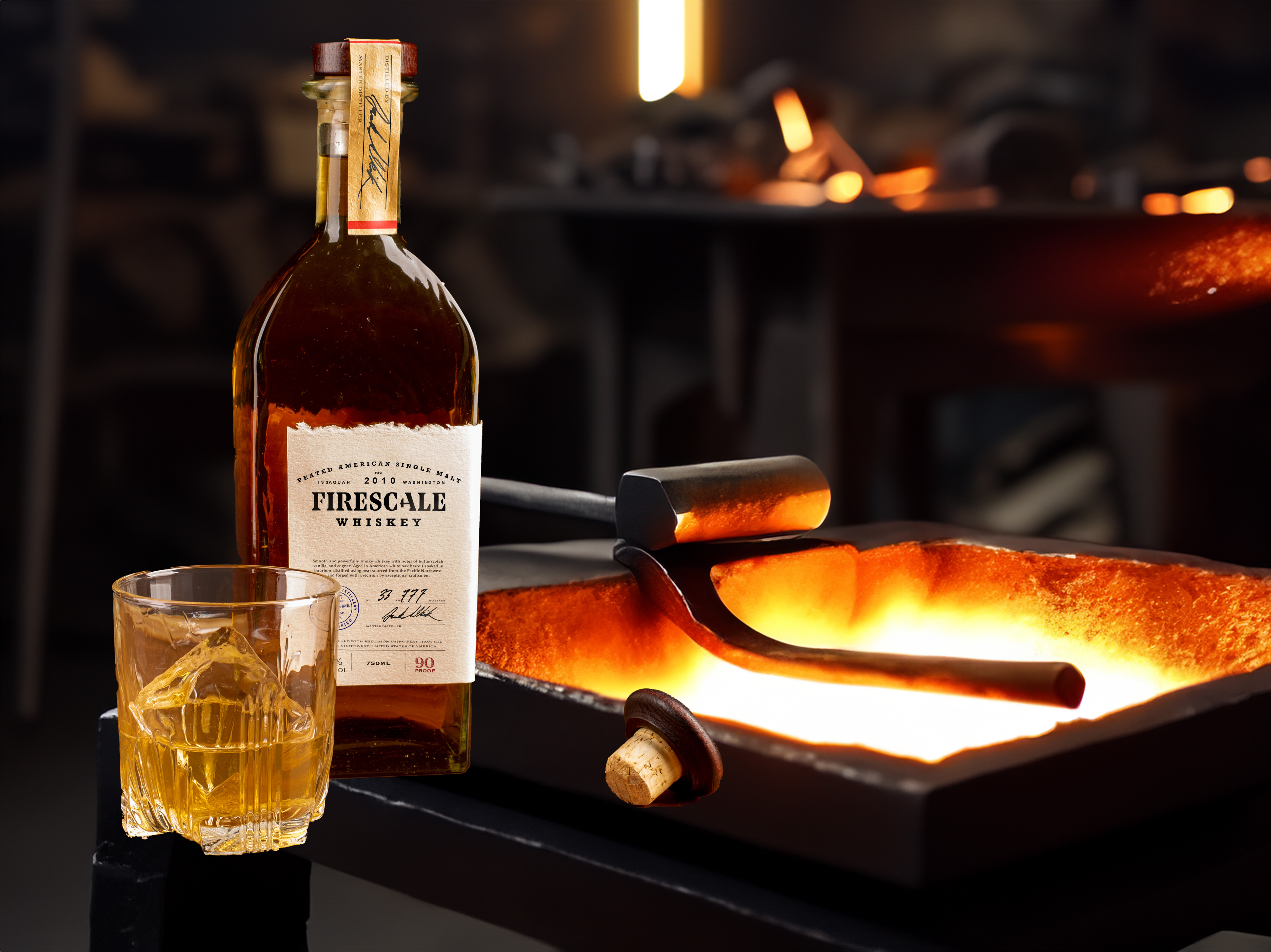
Paper and glass prototypes gave a feel for the real product.
I brought the concept to life through styled renders and real-life mockups, focusing on the tactile, imperfect qualities that define the brand. The warm, earthy color palette reinforced the handmade character, while the absence of plastic and high-gloss finishes kept the look authentic and grounded. Every element — from the bottle shape to the label textures — was chosen to evoke craftsmanship, durability, and a connection to tradition.
From Concept to Cohesion
- The bottle’s organic aesthetic comes together with a wooden cork top and torn paper label. I chose beige, medium-toothed drawing paper to match the design’s warm tone, paired with a darker parchment tamper seal whose handwritten script adds to the niche, handcrafted feel.
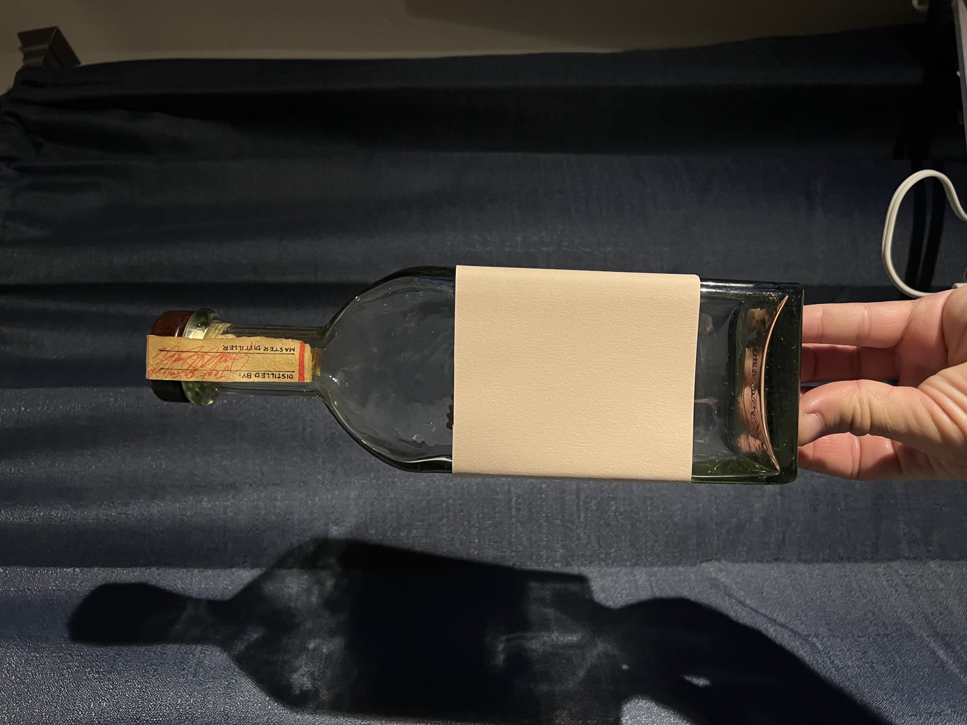
Perfect Imperfections
- The torn label with a graphite-written serial number and the imperfections in the glass, through which blotchy shadows warped onto the background led to further inspiration with the rugged and gritty story of the brand.
Color Harmony In Context
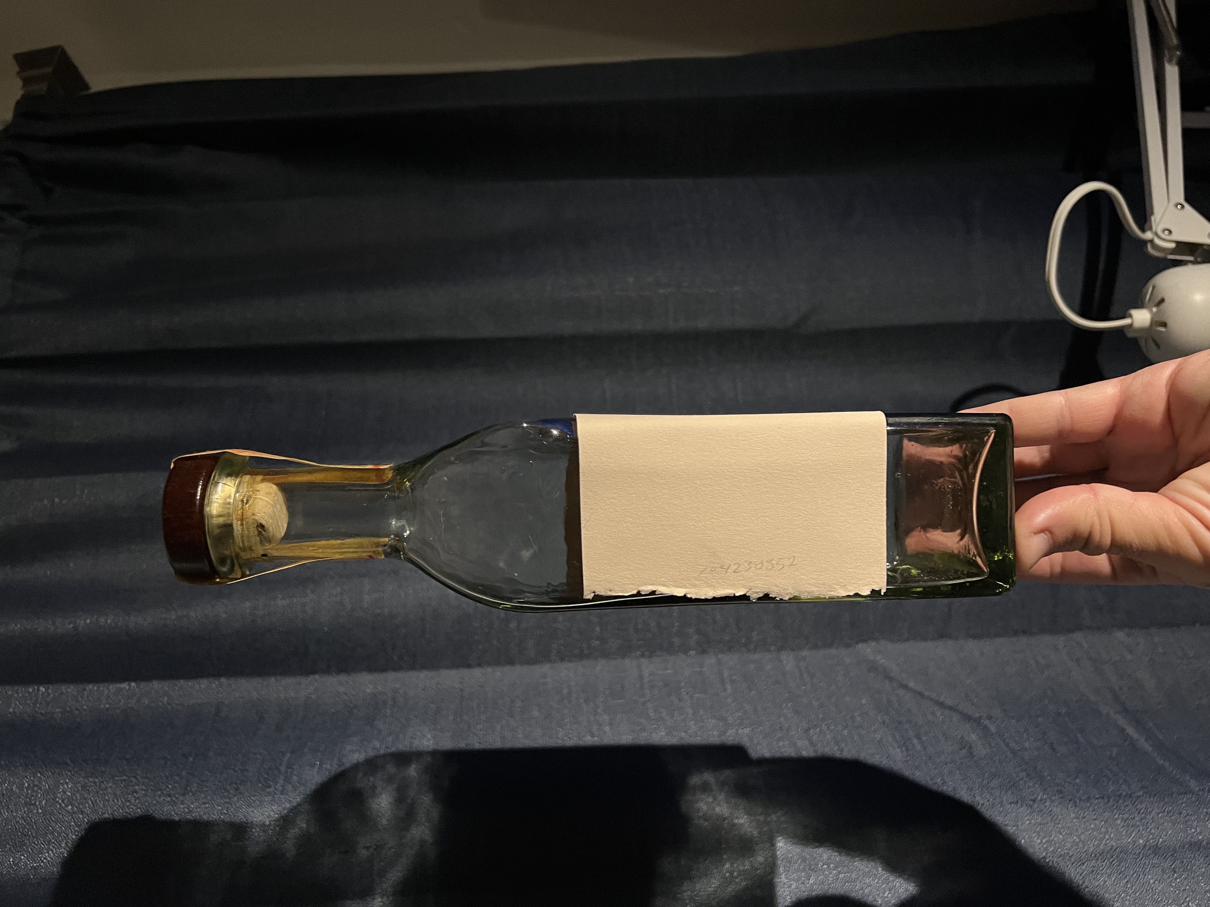
- Adding the whiskey reveals how the label, cork, and seal interact with the amber tones, reinforcing the warm, organic palette established in the concept phase.
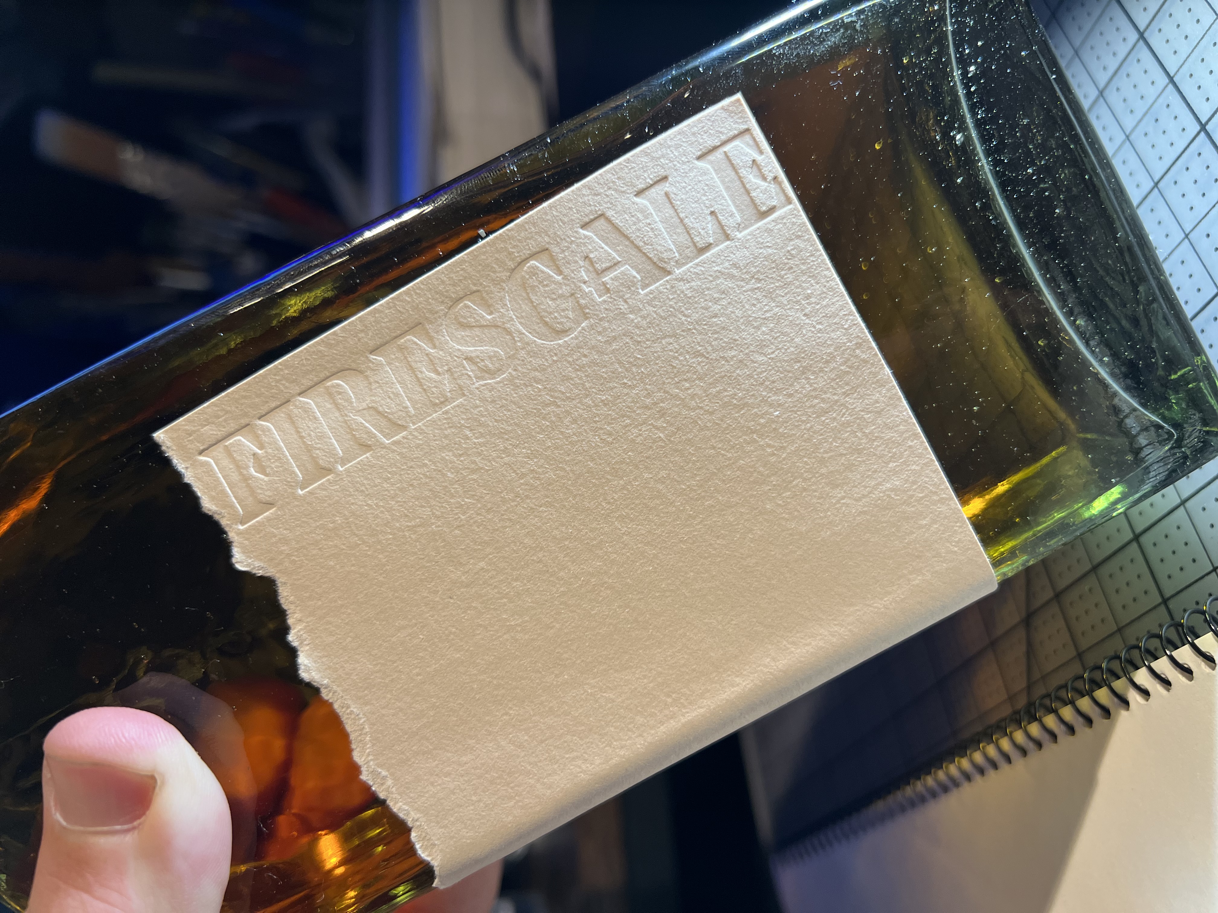
Tactile Details
- To preserve the handcrafted character of the product, I chose to emboss the logo directly into the label rather than print it. The design was carved—using a process that could just as easily have been done by hand—and pressed into the paper, creating a tactile mark that blends seamlessly with the bottle’s organic aesthetic.
Sealing with Intention
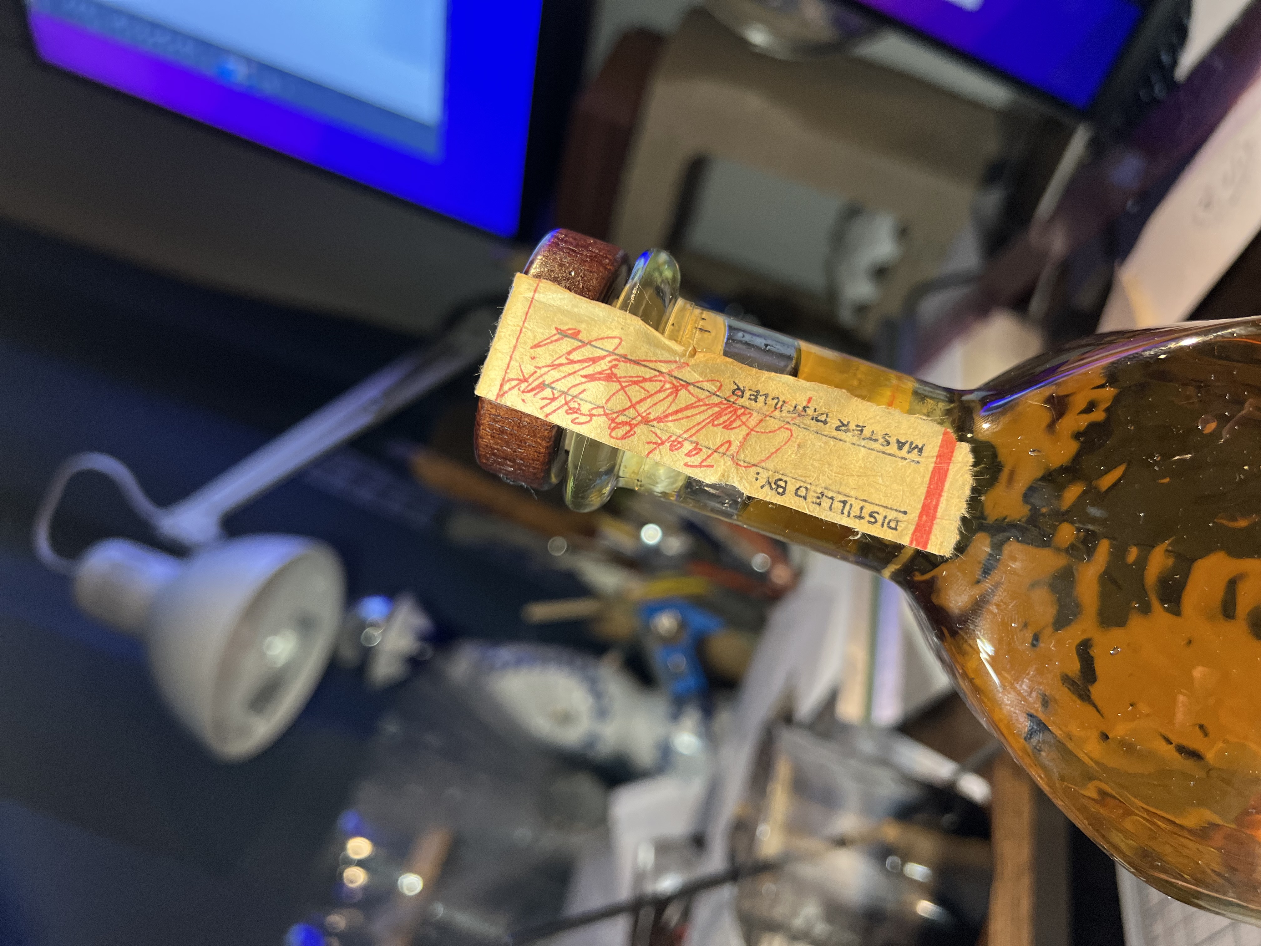
- The tamper-proof seal was designed to feel personal and deliberate, as if the master distiller had filled out each one by hand before placing it on the cork. This small, imperfect detail preserves the brand’s handcrafted identity and reinforces its niche, old-world aesthetic.

Tiny Details
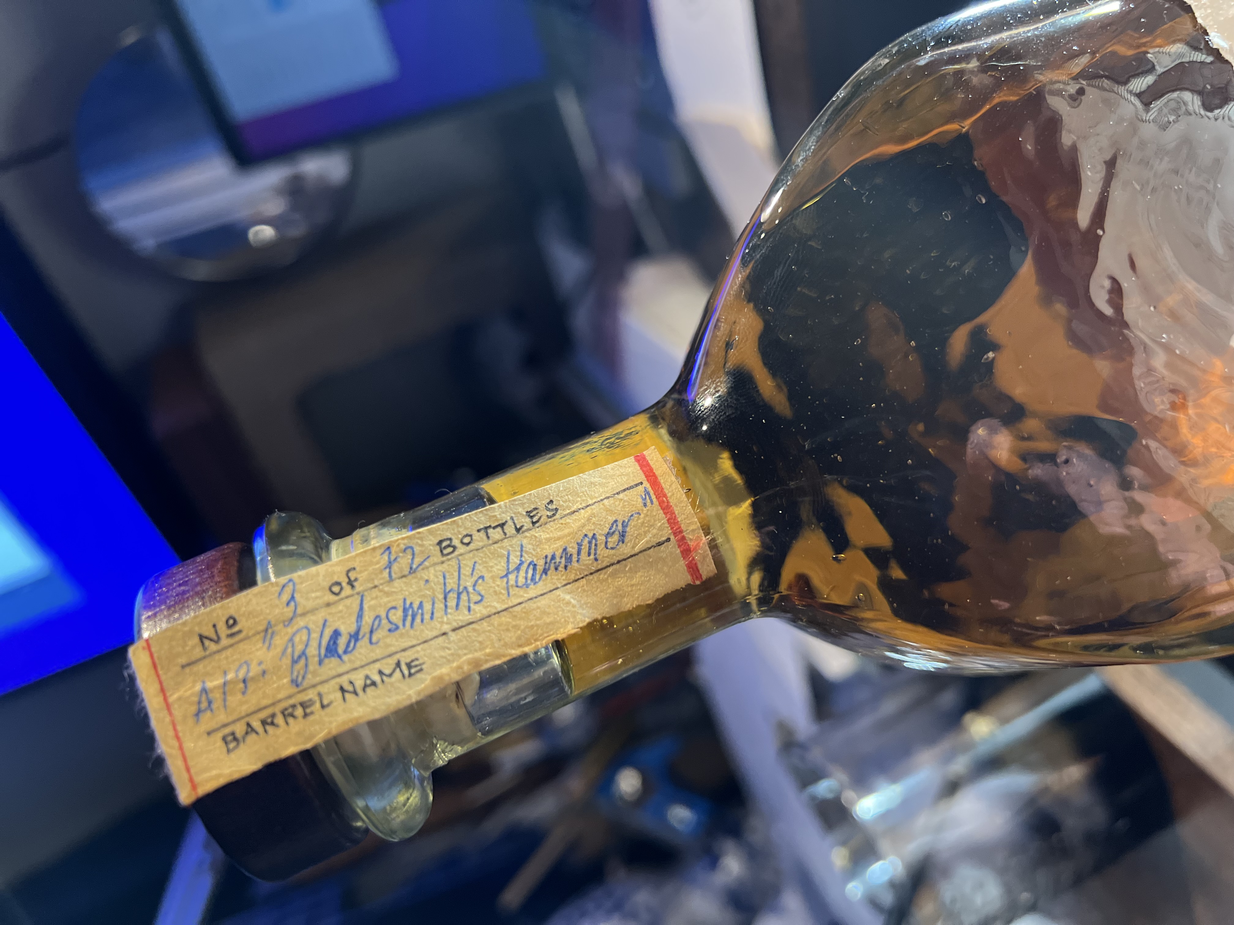
- I figured that the year of aging could be perforated onto each seal, augmenting the tactile craft of the product.
Signed Like a Painting
- As a final touch, each seal is signed by the master distiller, adding authenticity and trustworthiness to the brand, increasing marketability and potential as a collector's item, and giving the brand a further personal touch.
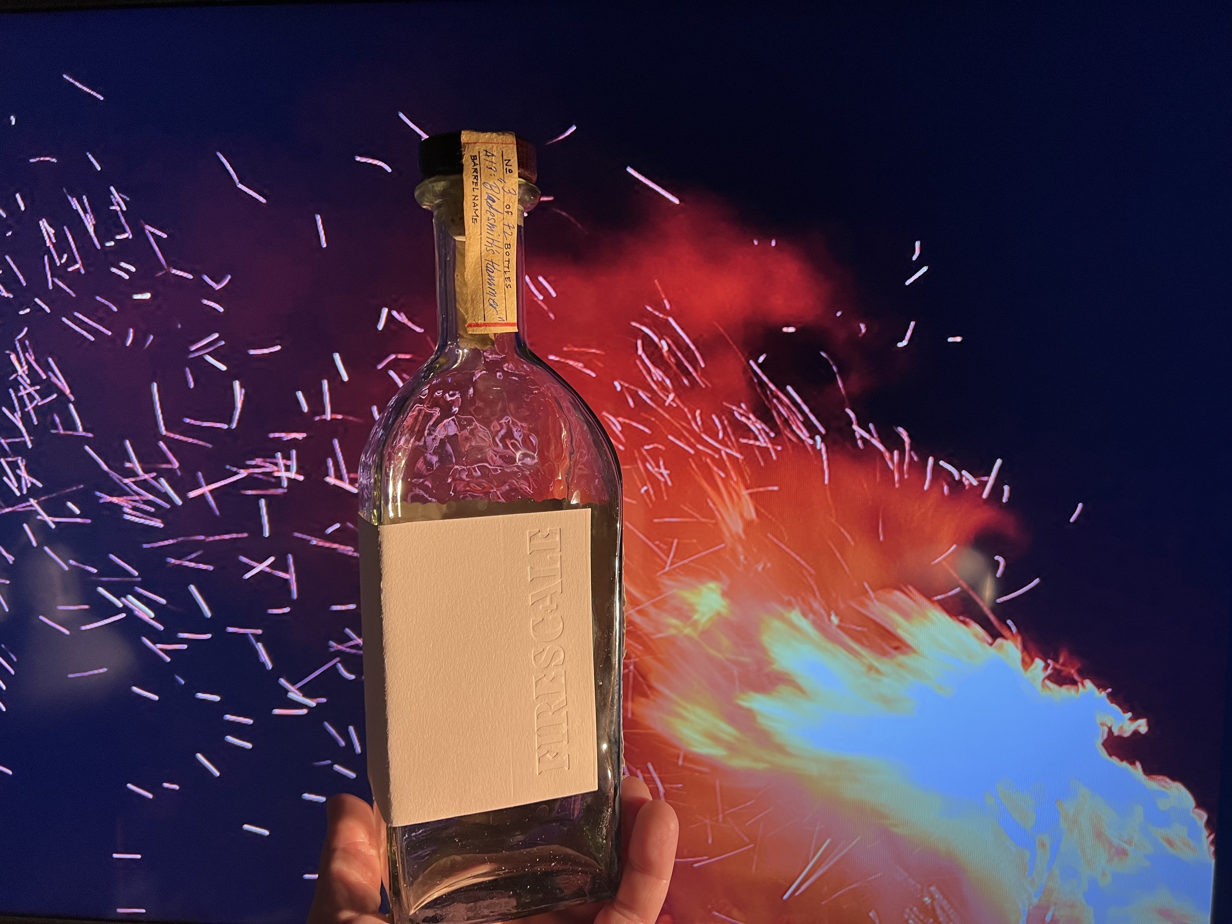
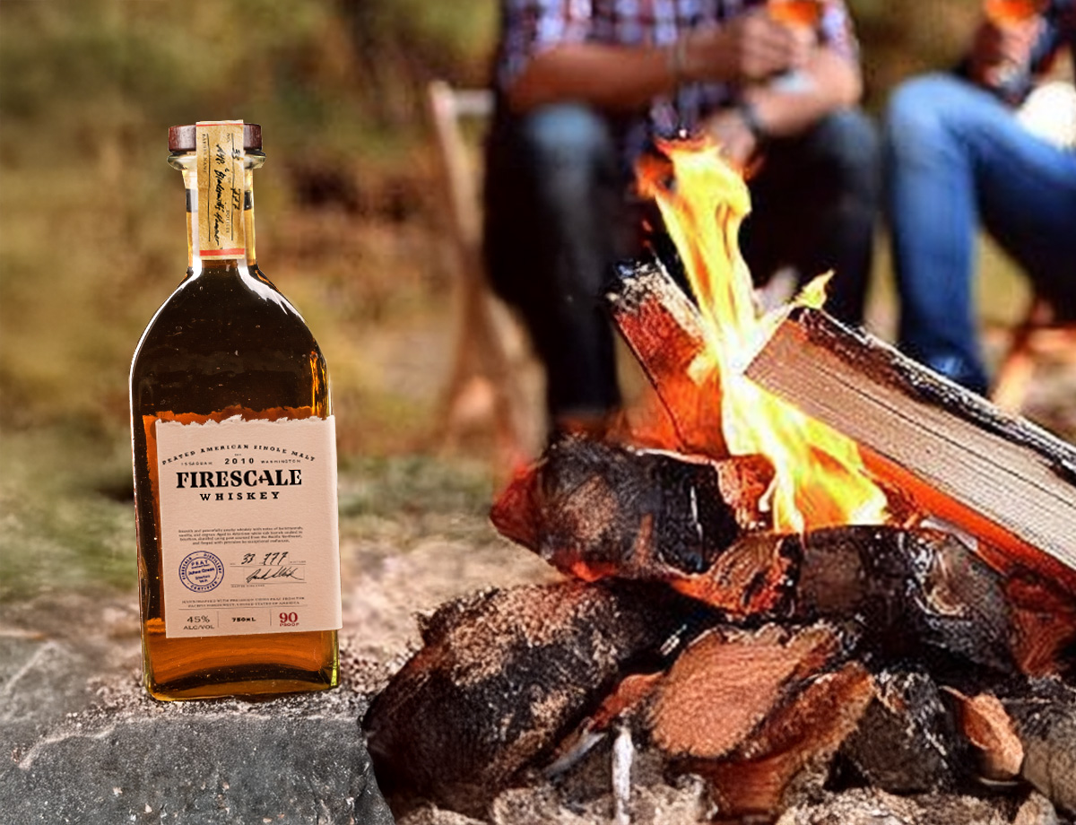
Environmental Mockup
- To see how the product would look while in situ during marketing campaigns, I photographed the mockup in front of a TV playing a video of a campfire.

Social Media Launch
An online presence built for a bold, heritage-driven audience.
The brand’s online presence channels a distinctly masculine, heritage-driven voice — gritty yet refined. Posts celebrate craftsmanship, patriotism, and tradition through bold imagery, sharp typography, and rich, tactile visuals. Whether showcasing the heat of the forge, the American flag, or the rich amber of the whiskey itself, every post reinforces the brand’s identity as a maker’s spirit — unapologetically authentic and rooted in old-world skill.


The Brand in the Wild
Generative AI helped with marketing and product promotion.
From the distillery floor to a customer’s liquor cabinet, the brand holds its character at every step. Whether it’s displayed on a shelf, poured at a bar, or gifted as a collector’s item, the design communicates craftsmanship, grit, and authenticity. The consistent visual language—rooted in heritage textures, strong typography, and tactile details—ensures the product feels unmistakably premium and true to its story, no matter where it’s encountered.
Reflection & Value
Firescale helped refine my physical and digital storytelling skills.
This project reflects my ability to craft a compelling brand story, uniting heritage and market appeal. It demonstrates comfort working across both physical and digital product design, ensuring the brand feels authentic in every touchpoint. Above all, it shows my commitment to honoring real craftsmen and tradition—preserving the character that makes a brand unforgettable.


